Why Colour Matters in Visual Management
Colour is one of the fastest ways to communicate meaning in the workplace. It creates clarity, reinforces standards, and helps people take the right action quickly. Among all colours, red is the most powerful when it comes to urgency and stopping problems before they grow.
Why Red Works
Red has universal recognition and immediate impact:
-
Signals urgency – red naturally draws the eye and makes people pause.
-
Widely understood – across industries and cultures, red is linked to warnings, alerts, and safety.
-
Forces action – psychologically, red is a trigger colour that demands attention and a decision.
This makes red ideal for drawing focus to the most critical information in Lean, 5S, and Continuous Improvement systems.
Examples of Red in Action
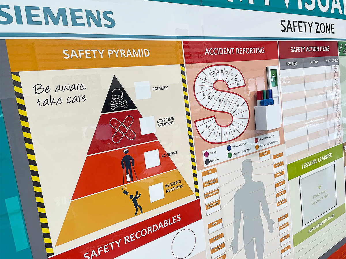
Stop and Safety Indicators
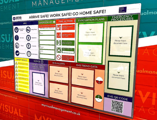
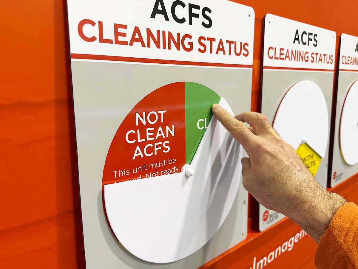
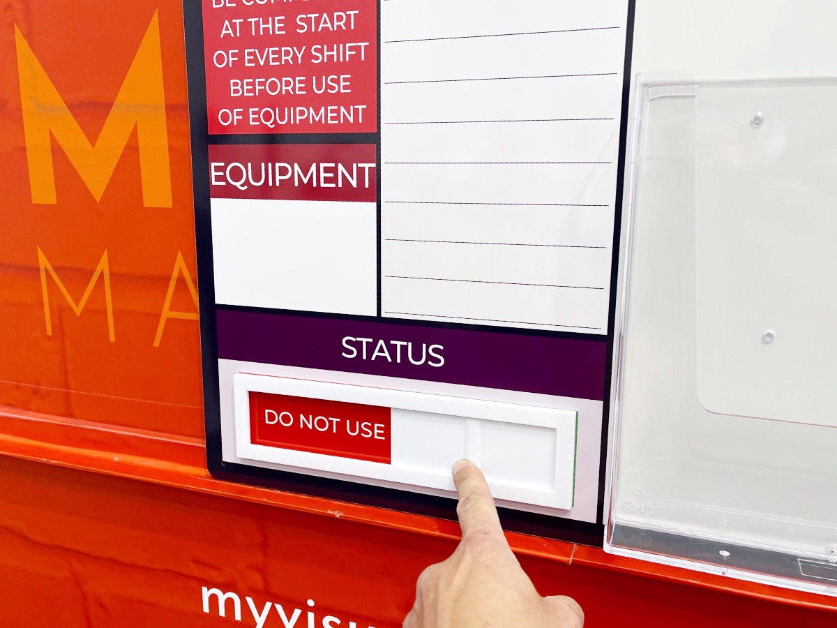
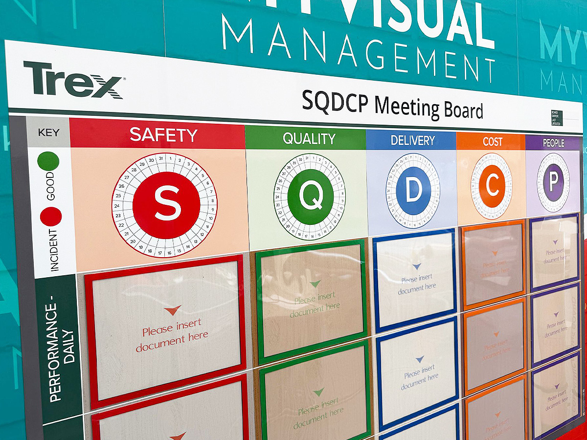
Red is often used for stop signs, hazard markings, and safety alerts. It creates an unmissable message to pause, check, or act with caution. See further status indicator options.
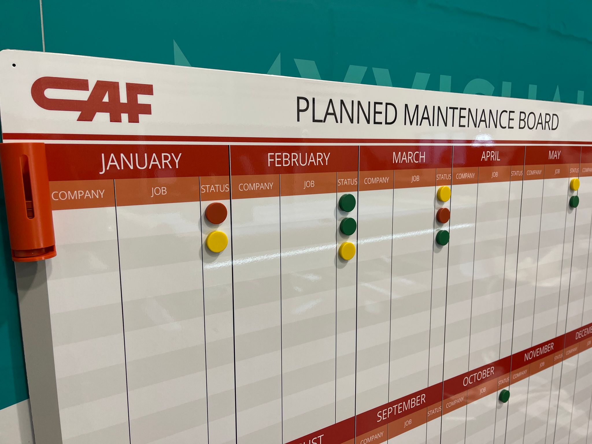
Escalation Boards
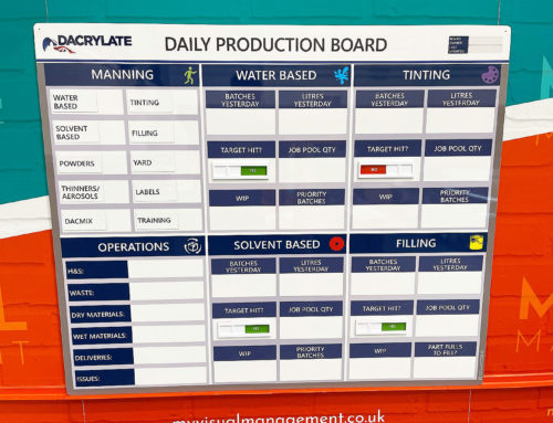
Red is effective for highlighting issues that need immediate attention. If a task, KPI, or process is marked in red, it’s clear to everyone that it must be prioritised.
Shadow Boards and Tool Control
Missing tools can be shown in red outlines, making it clear at a glance when equipment is not returned.
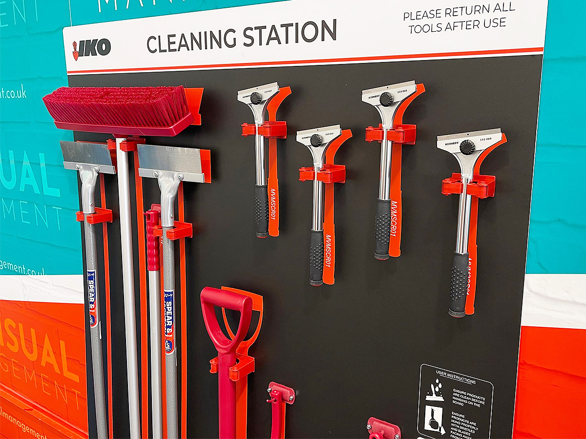
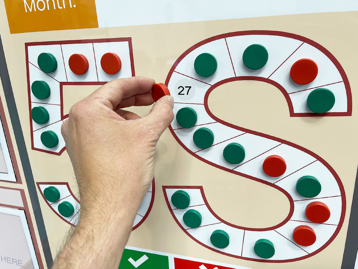
Colour-Coded Cleaning Stations
Red is also an effective choice in colour-coded cleaning stations, where each area of the workplace has its own designated colour. By assigning red to a cleaning zone or set of tools, teams can instantly see which equipment belongs where and prevent cross-contamination between areas. This is especially useful in food production, healthcare, and environments where hygiene standards are critical.
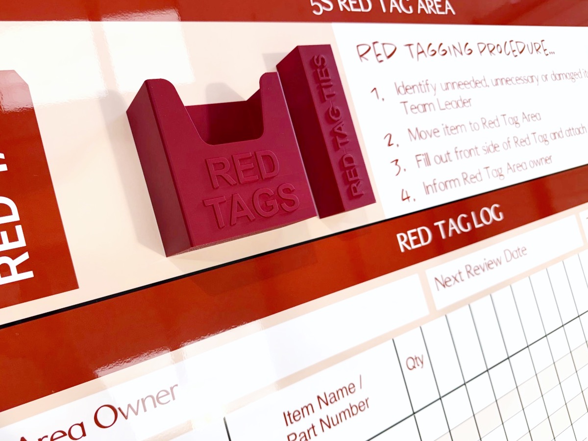
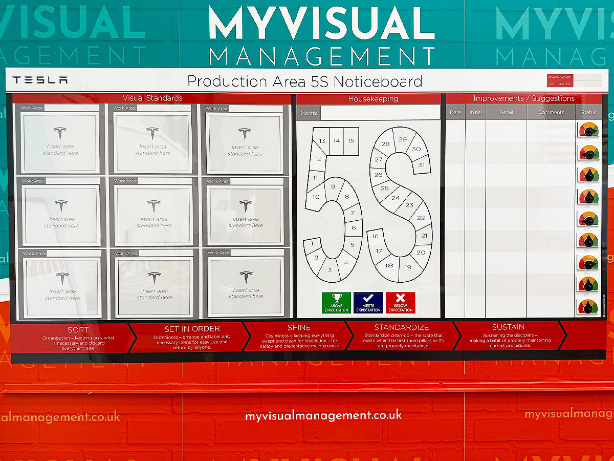
Red Tagging in 5S
During the Sort stage of 5S, red tags are commonly used to identify items that are unnecessary, broken, or in the wrong place. The tag signals that the item needs review or removal. This practice keeps workplaces lean and uncluttered, while making decisions about what stays and what goes visible to the whole team.
Status Cards and Magnets
Red cards or magnets on boards signal critical issues, blocked work, or overdue actions. They act as visual triggers to resolve problems fast.
Best Practices for Using Red
To get the most from red in your visual systems:
-
Use sparingly for signals – ideally, red should mean urgent or critical. If your brand already uses a lot of red, make sure your “alert red” is used in a way that still feels distinct.
-
Keep consistency – define what red means in your system (stop, hazard, escalation, red tag, urgent task) and stick with it.
-
Create contrast – if red is part of your branding, use shades, patterns, borders, or icons to separate branding red from alert red. For example, a bold red header may be branding, but a red circle magnet always signals escalation.
-
Maintain visibility – red is powerful only if it looks sharp and clear. Replace faded markers or outlines so the signal stays strong.
Red in Continuous Improvement Culture
Red isn’t just about warnings — it also plays a key role in building a culture of continuous improvement. By making problems visible, red gives teams the opportunity to take ownership, solve issues quickly, and prevent them from happening again. Instead of hiding mistakes or delays, red draws them into the open where they can be addressed constructively.
Red in Visual Standards and Communication
Red is often used in standard operating procedures (SOPs) and work instructions to highlight critical steps or safety checks. By marking the “must do” points in red, teams can easily differentiate them from the rest of the process. This ensures that the most important standards are never overlooked, even in busy or high-pressure environments.
Balancing Red with Other Colours
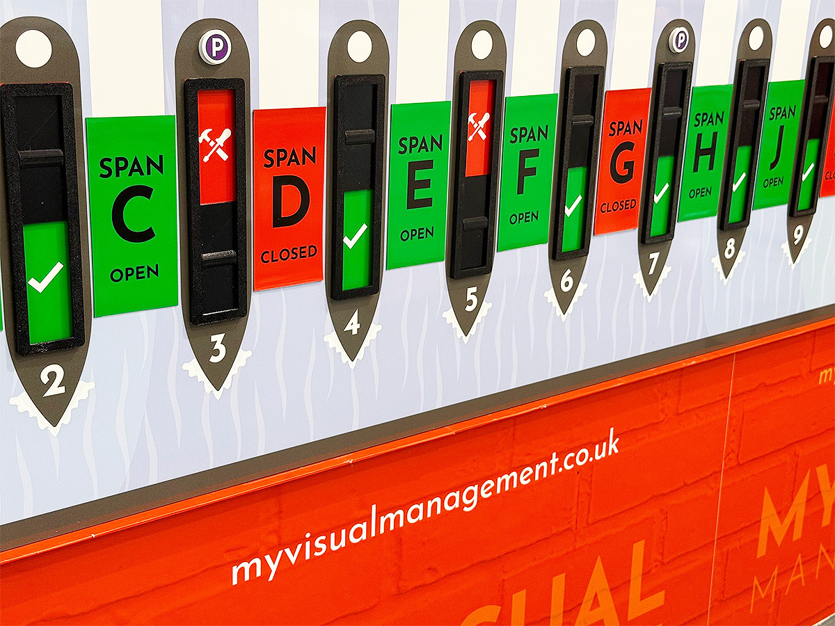
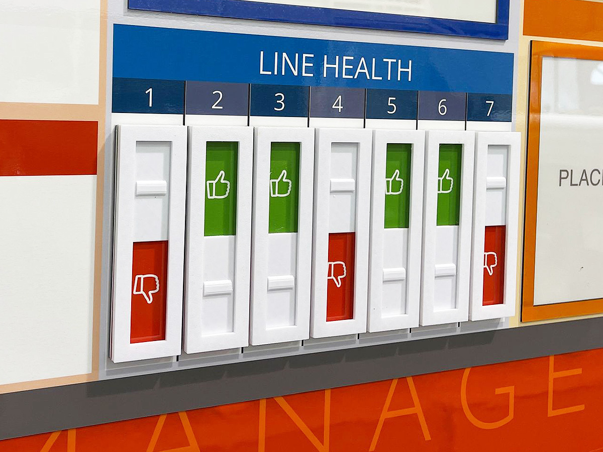
In many systems, red works best as part of a wider colour-coding approach. For example, the traffic light method (red, yellow, green) is widely used to communicate status at a glance:
-
Green – everything is on track.
-
Yellow – caution or needs checking.
-
Red – urgent, problem, or stop.
When combined in this way, red becomes part of a simple and universally understood system that supports fast decisions and clear prioritisation.
Conclusion
Red is the colour of urgency, action, and safety in visual management. From red tags in 5S to escalation boards and hazard markers, it ensures that the most important issues are never ignored.
Explore our galleries of visual management examples see how powerful visuals help teams respond quickly and keep standards high.
Shades of red work for safety
Colour code cleaning stations
Use red for priority status
Facilitate a red tagging system to remove unwanted clutter
Red is visually striking, particularly in combination with green for status
Inspiring action, red is engaging and initiates a response
Make alert red differ from a brand red
Deliver strong contrast and visual resonance
Brightly convey a sense of responsibility to your team
Use yellow as part of colour coding
Colour code your boards to full effect
Further examples


CI with dry wipe status circles

Continuous Improvement steps

CI Kanban board with status tickets

Continuous Improvement strategy board

QMS Overview Board

Theatre Improvement Board

CI foreign langauage board

Continuous Improvement status

Concerns Board

Short Interval Control board

Complaints board

Short Interval Control

Continuous Improvement board

Short Interval Control

PDCA board

Use status circles for updates

Kaizen for KPI tracking

Line Continuous Improvement

Kanban Continuous Improvement

Dry wipe status circles

Plan Do Check Act status dial

Processes for Continuous Improvement

Kaizen for Continuous Improvement

Loss Elimination Board

Colour coding Continuous Improvement

Colour code your Plan Do Check Act

Show your targets

Plan Do Check Act Board

Continuous Improvement Process Board

Use colour for Continuous Improvement

Use colour in your 5S design

Kaizen room meeting schedule

Lean environment strategies

The PDCA cycle visually

Show Continuous Improvement visually

Plan Do Check Act status dial

Kaizen PFU boards

Errors Board

Short Interval Control Board

Kanban Continuous Improvement

PDCA cycle

Show your processes

Track daily progress

Workstream whereabouts CI

SIC status board

Track customer feedback performance

Add status dials to your 6S board

Update progress with status meters

Plan Do Check Act board

Use the Plan Do Check Act cycle

Food Production CI

KATA Improvement

Plan Do Check Act

Track targets as a department

KPI board with document holders

Practical Problem Solving board

Visual Management with status dials

Status dials with percentages

Use dry wipe status indicators

Quality Station Continuous Improvement
Our Approach
We create visual management boards everyday. As a result we have plenty of experience. We work for organisations in food production, the power industry, national rail, pharmaceuticals, education, healthcare, packaging and distribution.
Our team works with a simple idea or sketch and creates a professionally designed layout. This is then turned into a highly functional visual management board.
We offer customised options because we want to create the perfect board for you. So, here are a few examples. We can add magnetic areas or a dry-wipe finish (for use with whiteboard pens). Furthermore, you can choose Red/Green sliders or R.A.G. (Red, Amber, Green) status dials so you can quickly and visually update your board. These are just a few examples of the ways in which our boards can be tailored to meet your needs. You may also be interested in whiteboard overlays that can be used on top of an existing magnetic board.