Why Colour Matters in Visual Management
Colour is one of the most effective tools for making systems clear, consistent, and easy to understand. Each colour carries its own meaning and purpose. While red signals urgency and yellow grabs attention, blue often supports communication, control, and organisation.
Why Blue Works
Blue conveys trust and stability, which makes it an ideal choice for visual management.
-
Calm and clear – blue feels easy on the eye and teams can use it widely without overwhelming staff.
-
Associated with information – workplaces often choose blue for communication, instructions, and records.
-
Supports organisation – psychologically, blue represents order and reliability, so it strengthens long-term standards.
As a result, many organisations use blue for boards, documentation, and structured systems where clarity matters more than urgency.
Examples of Blue in Action
Information and Communication Boards
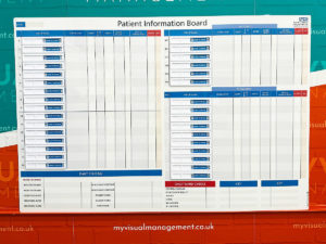
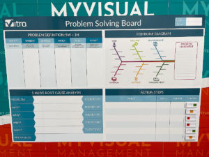
Teams frequently choose blue as a background for communication boards, noticeboards, and documentation displays. This colour helps information stand out in a structured way while avoiding unnecessary distraction.
Cleaning Stations
In colour-coded cleaning systems, managers often assign blue to general or low-risk areas. By doing this, they prevent cross-contamination and make it simple for teams to see which tools belong in each zone.
KPI and Planning Boards
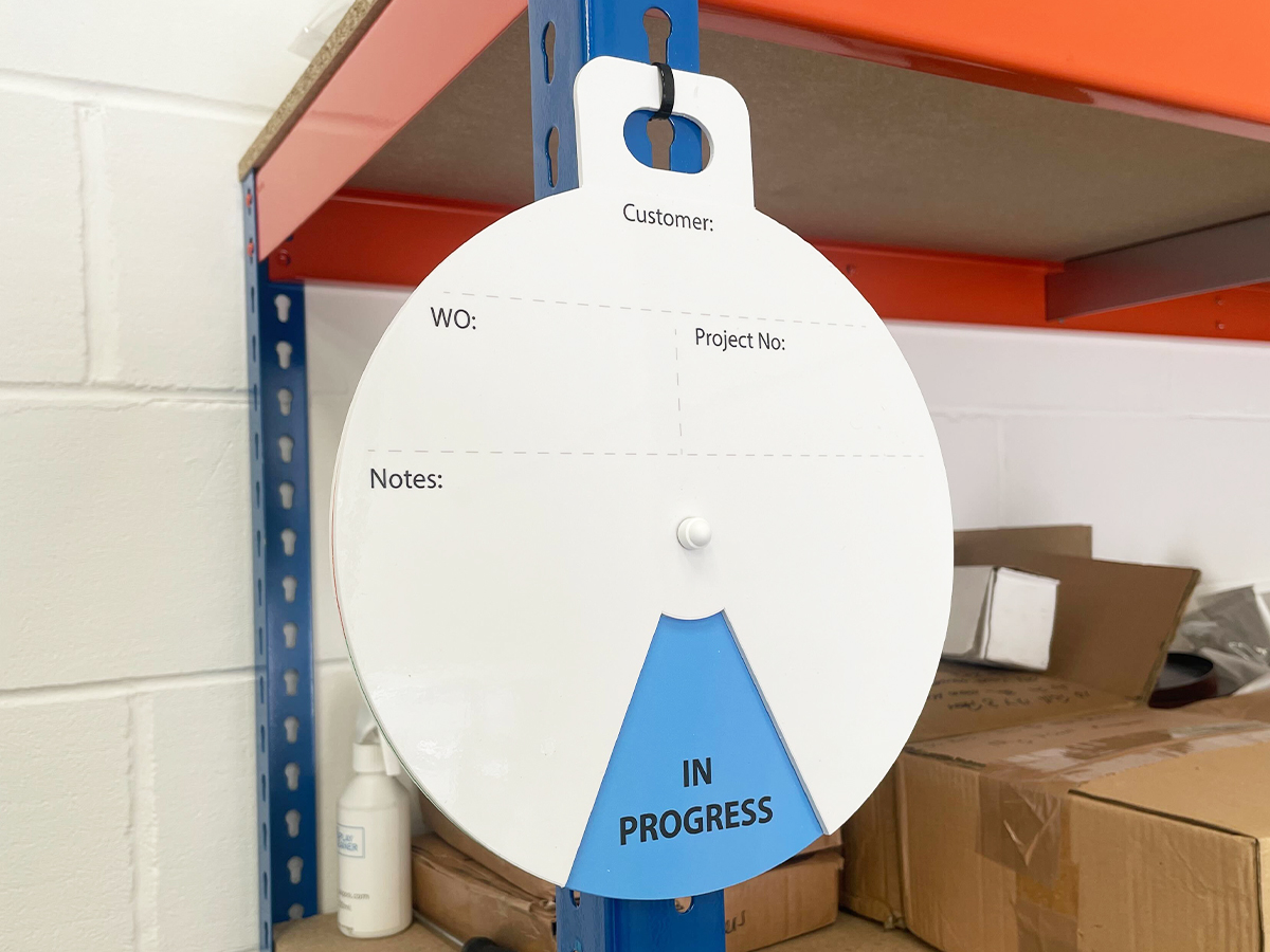
Many organisations highlight planned work, routines, or stable performance zones in blue. This choice provides focus without creating urgency, so teams can track progress calmly and consistently.
Shadow Boards and Tool Control
Teams sometimes select blue for tool outlines or holders when they want clarity and organisation. Unlike red or yellow, which carry urgency, blue signals order and stability.
Blue in Healthcare and the NHS
In healthcare, colour coding plays a vital role in maintaining hygiene and safety. NHS guidelines often use blue, including for ensuring tools stay separated from those used in higher-risk areas. For example, hospitals may allocate blue brushes and cloths to wards, offices, and waiting rooms. This simple system helps staff prevent cross-contamination and maintain cleanliness standards.
Visual management boards in NHS settings also rely on blue for patient and information displays. Because the colour conveys calmness and reliability, it supports environments where patients and staff need clarity and reassurance.
Blue for Standardisation Across Sites
Large organisations often need consistent systems across multiple sites. By choosing blue as the standard colour for certain boards or cleaning zones, companies create familiarity for staff who move between locations. This consistency reduces training time, prevents mistakes, and reinforces shared standards. For example, if every site uses blue boards for shift communication, employees instantly know where to look for updates.
Balancing Blue with Other Colours
Blue is powerful on its own, but it becomes even more effective when combined with other colours. Many businesses use a colour hierarchy: red for urgent issues, yellow for items that need checking, green for tasks running smoothly, and blue for stable information or communication. This balance makes it easy for staff to read the workplace at a glance and focus on what matters most.
Best Practices for Using Blue
To get the most from blue in visual management, consider the following:
-
Use it for clarity and stability – blue works best for structure, planned work, and consistent systems.
-
Pair it with contrast – white or light text on a blue background creates strong readability.
-
Stay consistent – once you assign blue a meaning (e.g. “information” or “planning”), stick with it so staff always understand its purpose.
-
Combine it with other colours – blue fits naturally into multi-colour systems, where red and yellow signal urgency and blue represents steady information.
Blue as a Symbol of Hygiene and Cleanliness
Blue is widely recognised as a hygienic colour. Unlike red, which signals danger, or yellow, which warns of caution, blue communicates cleanliness and control. This makes it a popular choice for boards, equipment, and signage in environments where hygiene must be visible and unquestionable. By using blue consistently, organisations reinforce the message that cleanliness is not optional but a standard part of daily practice.
Blue in Food and Healthcare Environments
In both food production and healthcare, blue plays a vital role because it is not naturally found in most foodstuffs or medical environments. If a blue item such as a glove or cleaning cloth becomes misplaced, it can be easily spotted and removed. For this reason, many cleaning tools and disposable items are manufactured in blue. When combined with visual management boards and storage systems, this colour-coding ensures hygiene standards are maintained while also improving safety and efficiency.
Conclusion
Blue acts as the colour of clarity, communication, and consistency in visual management. In healthcare and the NHS, it also supports hygiene and safety through colour-coded cleaning systems. Whether you apply it to cleaning stations, KPI boards, or communication displays, blue helps workplaces stay organised and reliable.
Looking to bring clarity and organisation to your workplace? Our custom visual management boards and stations are designed to keep information clear and accessible. Get in touch with our team today.
Blue works for PPE recognition
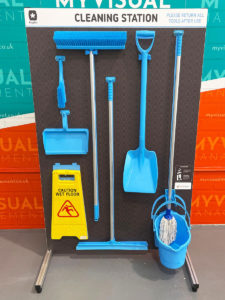
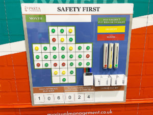
Colour code cleaning stations using blue
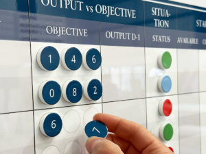
Use blue for status
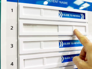
It is ideal for healthcare and clinical settings
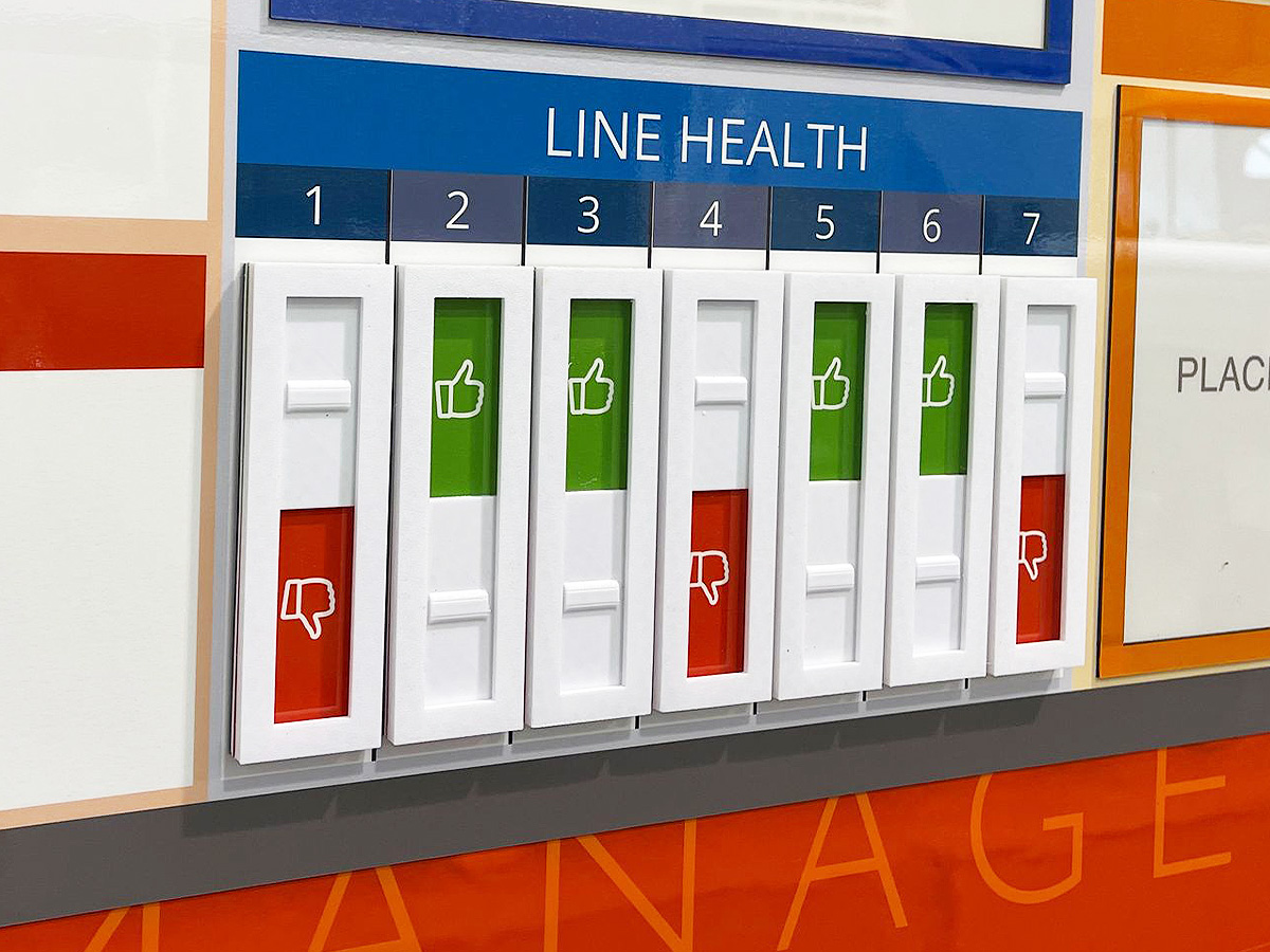
Shades of blue offer excellent backdrop to give red and green status visibility
Blue offers standout
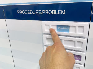
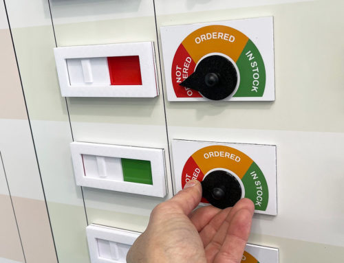
Use custom blue status sliders
Deliver strong contrast and visual resonance with blue
One of the most popular brand colours. For example, the NHS uses blue
Give visibility to particular parts of the board with clever use of blue
Colour code your visual management in blue
Further examples


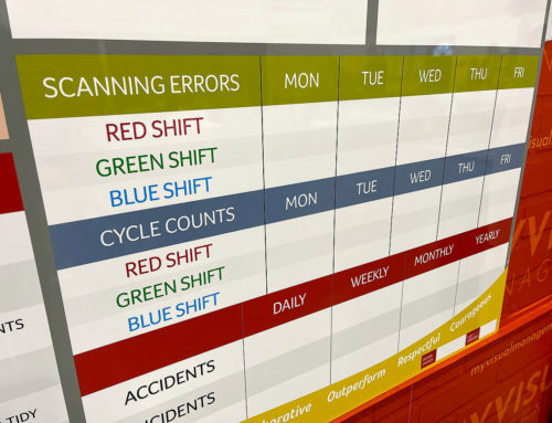
Short Interval Control board

Continuous Improvement steps

CI Kanban board with status tickets

Continuous Improvement strategy board

QMS Overview Board

Theatre Improvement Board

CI foreign langauage board

Continuous Improvement status

Concerns Board

Complaints board

Short Interval Control

Continuous Improvement board

Short Interval Control

PDCA board

Use status circles for updates

Kaizen for KPI tracking

Line Continuous Improvement

Kanban Continuous Improvement

Dry wipe status circles

Plan Do Check Act status dial

Processes for Continuous Improvement

Kaizen for Continuous Improvement

Loss Elimination Board

Colour coding Continuous Improvement

Colour code your Plan Do Check Act

Show your targets

Plan Do Check Act Board

Continuous Improvement Process Board

Use colour for Continuous Improvement

Use colour in your 5S design

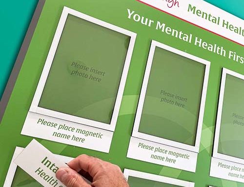
Kaizen room meeting schedule

Lean environment strategies

The PDCA cycle visually

Show Continuous Improvement visually

Plan Do Check Act status dial

Kaizen PFU boards

Errors Board

Short Interval Control Board

Kanban Continuous Improvement

PDCA cycle

Show your processes

Track daily progress

Workstream whereabouts CI

SIC status board

Track customer feedback performance

Add status dials to your 6S board

Update progress with status meters

Plan Do Check Act board

Use the Plan Do Check Act cycle

Food Production CI

KATA Improvement

Plan Do Check Act

Track targets as a department

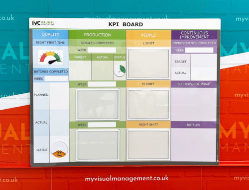
KPI board with document holders

Practical Problem Solving board

Visual Management with status dials

Status dials with percentages

Use dry wipe status indicators

Quality Station Continuous Improvement
Our Approach
We create visual management boards everyday. As a result we have plenty of experience. We work for organisations in food production, the power industry, national rail, pharmaceuticals, education, healthcare, packaging and distribution.
Our team works with a simple idea or sketch and creates a professionally designed layout. This is then turned into a highly functional visual management board.
We offer customised options because we want to create the perfect board for you. So, here are a few examples. We can add magnetic areas or a dry-wipe finish (for use with whiteboard pens). Furthermore, you can choose Red/Green sliders or R.A.G. (Red, Amber, Green) status dials so you can quickly and visually update your board. These are just a few examples of the ways in which our boards can be tailored to meet your needs. You may also be interested in whiteboard overlays that can be used on top of an existing magnetic board.