Make your own communications dashboard. As a result, make communications visual. Furthermore, accessible – at a glance.
Visually effective communications dashboard
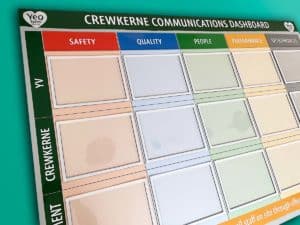
This example (pictured) is simple yet visually effective. Firstly, it makes clear communications across different processes. So, for example, those relating to safety. In addition, quality, people and performance. Finally, in relation to other specific projects.
Communications dashboard with document holders
Self-locating single sheet document holders are efficient. So, for instance, change or update information anytime. As a result, this is a flexible communications board.
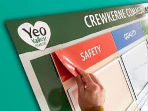
Magnetic titles
There is a further way this communications board is easy to update. It has magnetic headings. For example, the Safety title.
Making your own communications dashboard
Please feel welcome to make your communications visual.
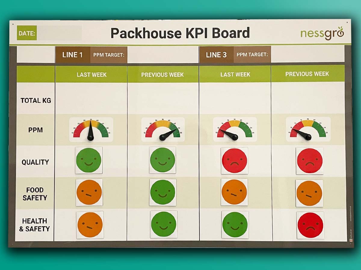
Further examples
Our Approach
We create visual management boards everyday. As a result we have plenty of experience. We work for organisations in food production, the power industry, national rail, pharmaceuticals, education, healthcare, packaging and distribution.
Our team works with a simple idea or sketch and creates a professionally designed layout. This is then turned into a highly functional visual management board.
We offer customised options because we want to create the perfect board for you. So, here are a few examples. We can add magnetic areas or a dry-wipe finish (for use with whiteboard pens). Furthermore, you can choose Red/Green sliders or R.A.G. (Red, Amber, Green) status dials so you can quickly and visually update your board. These are just a few examples of the ways in which our boards can be tailored to meet your needs. You may also be interested in whiteboard overlays that can be used on top of an existing magnetic board.


