Why Colour Matters in Visual Management
Colour is one of the most effective tools for communicating quickly and clearly in the workplace. Each colour carries its own meaning. Red highlights danger or escalation, yellow draws attention, and blue represents structure and calm. Green, by contrast, communicates safety, reassurance, and success.
When teams apply colour consistently, it becomes a shared visual language. This consistency allows everyone to understand status instantly. Green plays a vital role in that language because it shows safe conditions, high standards, and positive performance without the need for words.
Why Green Works
Green has strong psychological and cultural associations that make it ideal for visual management:
-
Signals “go” and progress – universally recognised as the opposite of red, green shows that everything is working as expected.
-
Represents safety and wellbeing – it marks safe routes, first aid points, and approved conditions.
-
Creates reassurance – psychologically, green feels balanced and calm, which helps reinforce a sense of control and confidence.
Because of these qualities, many organisations use green to highlight safety, performance, and hygiene. As a result, teams can quickly see when things are under control and when action is needed elsewhere.
Examples of Green in Action
Status and KPI Boards
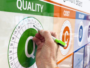
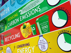
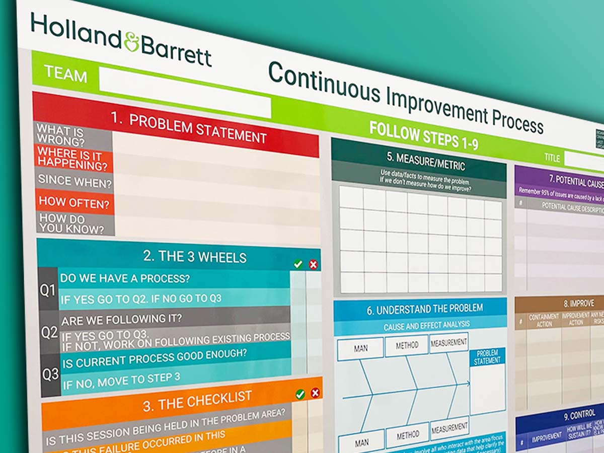
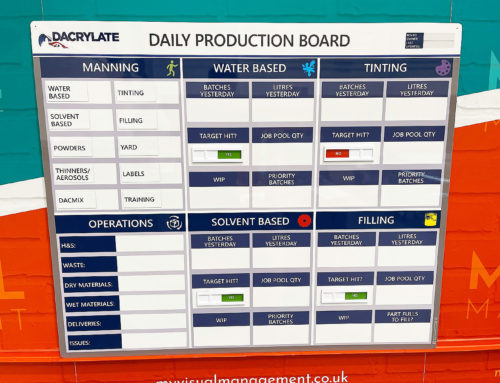
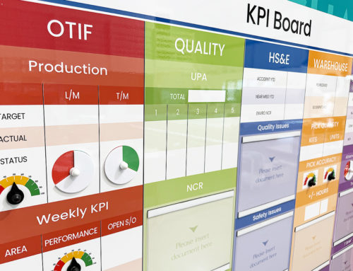
Teams often use green on performance and KPI boards to show that a target has been met or that a process is running smoothly. When a section turns green, everyone instantly knows that results are on track. This clear visual signal allows managers to focus on improvement areas while still celebrating success.
Status Indicators (RAG: Red, Amber, Green)
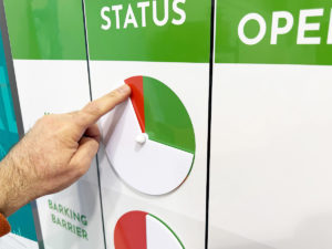
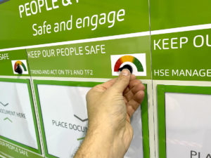
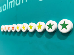
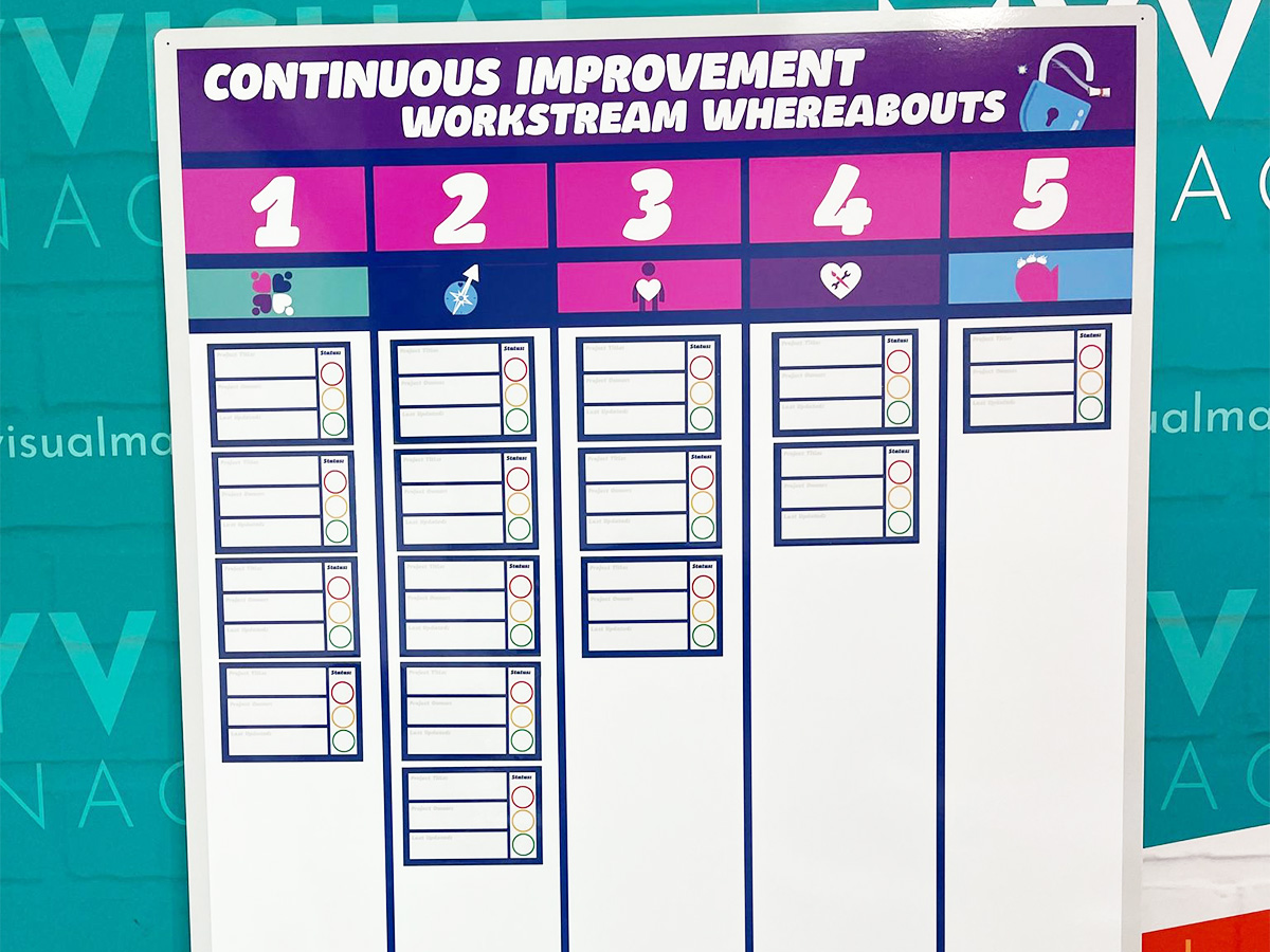
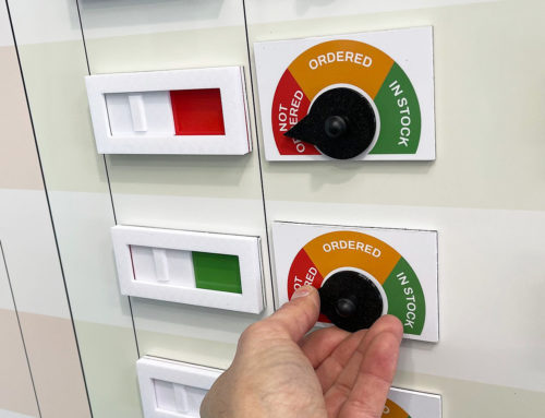
Many organisations rely on RAG status indicators to make priorities visible at a glance. Red, amber, and green markers form a simple but powerful system:
-
Red means an issue or stop.
-
Amber means caution or review.
-
Green means performing well or complete.
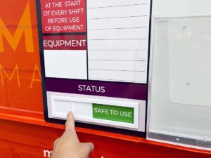
Our red and green status indicators make it easy for teams to communicate status quickly and accurately. When every board and process uses the same colour rules, teams develop a shared understanding of performance. This clarity helps everyone know what to focus on and what good looks like.
Safety Signage and Pathways
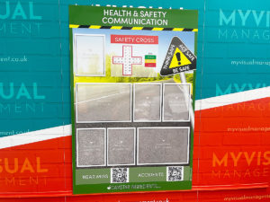
In workplaces where safety is critical, green markings highlight safe routes, emergency exits, and essential equipment. These visual cues increase confidence and help staff move safely through their environment. In addition, consistent use of green for safety supports compliance with regulations and builds trust in workplace systems.
First Aid and Emergency Equipment
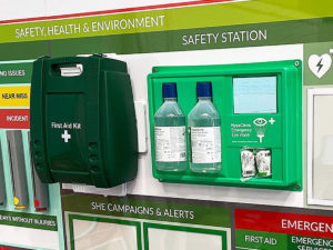
Green is universally linked with first aid and emergency care. First aid boxes, eyewash stations, and defibrillators use green so that people can find them quickly. Clear, well-positioned signage ensures staff know exactly where to go for help. By maintaining visible and well-managed first aid points, organisations create a proactive culture of care and safety.
Cleaning Stations and Hygiene Systems
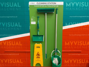
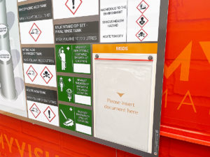
In colour-coded cleaning systems, managers often assign green to food preparation or kitchen areas. This practice separates cleaning tools by area and reduces the risk of cross-contamination. Because hygiene is a key part of safety, using green consistently reinforces high standards and helps teams keep environments clean and compliant.
Shadow Boards and Equipment Control
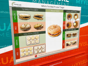
Some teams use green outlines or holders on shadow boards to show that tools and equipment are available and ready for use. This approach prevents loss, saves time, and makes good organisation visible. When everything is in its place and green-marked areas are complete, teams know that standards are being met.
Green in Healthcare and Hygiene
Healthcare environments, including the NHS, use green throughout their visual management systems because it represents hygiene, calm, and reassurance. Green identifies first aid kits, safe exit routes, and medical equipment storage areas. It is also used for cleaning tools in low-risk zones such as food service or patient areas. By linking green with safety and cleanliness, healthcare teams create well-organised, trusted spaces where both staff and patients feel confident.
Green and “What Good Looks Like”
Visual management isn’t just about finding faults — it also shows teams what good looks like. Green provides a clear visual cue for success. On KPI boards, green sections confirm that performance meets expectations. On cleaning stations or shadow boards, fully stocked green-marked outlines show that equipment is present and ready. Therefore, every time a team sees green, they see standards being met and systems working as intended.
Best Practices for Using Green
To use green effectively in visual management:
-
Reinforce success – apply green to show compliance, achievement, and safety so that staff know when systems are performing well.
-
Stay consistent – define exactly what green means in your workplace, whether that is “safe,” “on target,” or “complete,” and use it consistently.
-
Balance with other colours – combine green with red and amber to form a traffic-light system that instantly communicates risk or progress.
-
Keep it visible – refresh faded boards and worn indicators regularly, because bright, clean colour makes the message clear and credible.
Conclusion
Green brings safety, reassurance, and clarity to visual management. It helps teams see success, maintain hygiene, and react confidently in emergencies. From first aid points and cleaning stations to RAG indicators and KPI boards, green communicates that everything is under control.
When organisations use green consistently and purposefully, they make safety visible and show what good looks like in every part of their workplace.
Further information
Explore our galleries of visual management examples and see how this colour promotes confidence, safety, and performance.
Next step
Want to make safety and performance visible in your workplace? Our range of status indicators, visual management boards, and cleaning stations help your team stay aligned and informed.
Green works for First Aid recognition
Colour code cleaning stations using green
Use green for status – RAG or R/G
It is ideal for indicating SAFE
Show what good looks like using green
Drive engagement in site safety
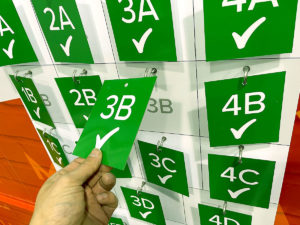
A green tick is a powerful indicator
Deliver strong contrast and visual for status
For denoting quality, green is a suitable candidate
Give visibility to particular parts of the board with clever use of green
Sustainability and green are synonymous
Create your own colour reference system using green
Health & Safety works with green predominant
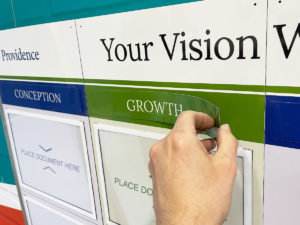
Growth and green work
Further examples
Our Approach
We create visual management boards everyday. As a result we have plenty of experience. We work for organisations in food production, the power industry, national rail, pharmaceuticals, education, healthcare, packaging and distribution.
Our team works with a simple idea or sketch and creates a professionally designed layout. This is then turned into a highly functional visual management board.
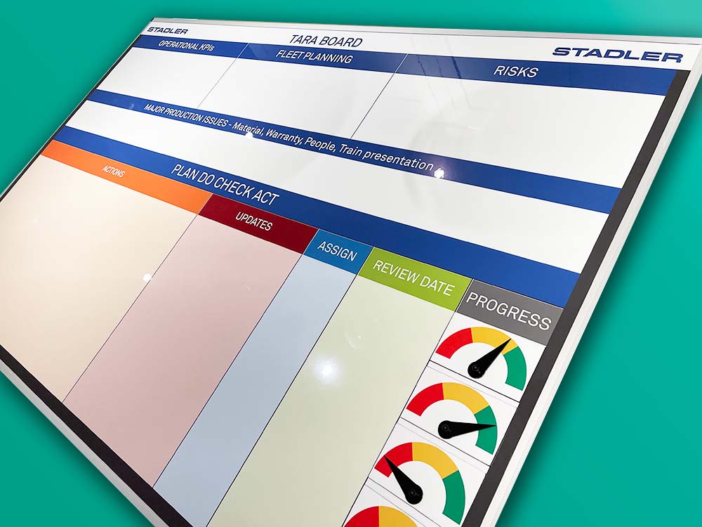
We offer customised options because we want to create the perfect board for you. So, here are a few examples. We can add magnetic areas or a dry-wipe finish (for use with whiteboard pens). Furthermore, you can choose Red/Green sliders or R.A.G. (Red, Amber, Green) status dials so you can quickly and visually update your board. These are just a few examples of the ways in which our boards can be tailored to meet your needs. You may also be interested in whiteboard overlays that can be used on top of an existing magnetic board.


