Visual Controls That Drive Behaviour: How Colour, Layout and Icons Improve Performance
Introduction — Visual Controls as Behavioural Design
Visual controls do more than display information — they shape human behaviour.
From manufacturing plants to hospitals, the most effective operational systems use colour, layout and icons to influence what people notice, how they act, and whether standards are followed.
In this article, we look at how visual controls drive behaviour, what the research says about human response to visual cues, and how organisations can use these principles to improve performance.
1. Why Visual Controls Work: The Behavioural Science
Visual controls function because they align with how humans process information:
We see before we think
Our visual system reacts in milliseconds — far faster than verbal or written processing.
Colour triggers instinctive responses
Red = urgent. Green = safe. Yellow = caution. These patterns are universal across industries.
Icons reduce cognitive load
A symbol communicates faster than a sentence. A crossed-out circle requires no translation.
Spatial layout programs habit
When a tool has only one logical place to live, returning it becomes automatic.
This is behavioural Lean — designing the workplace so the easiest behaviour is also the correct behaviour.
2. The Three Core Elements of Behaviour-Shaping Visual Controls
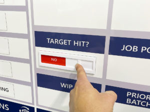
1. Colour Coding
Clear colour rules support:
-
Faster decision-making
-
Reduced ambiguity
-
Lower training burden
-
Standardised responses
Your magnetic status indicators, safety crosses, and KPI tiles embody this principle.
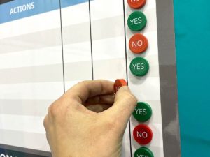
2. Icons & Symbols
Icons outperform text when:
-
Space is limited
-
Audience is mixed (multi-language environments)
-
Actions must be taken quickly
Research shows icons reduce error rates and search time — especially in 5S layouts and safety-critical areas.
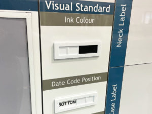
3. Layout & Visual Hierarchy
Information architecture determines what the eye sees first.
Effective boards follow:
-
Top area = headline status (green/red/amber)
-
Middle area = current KPI metrics
-
Bottom area = actions & owners
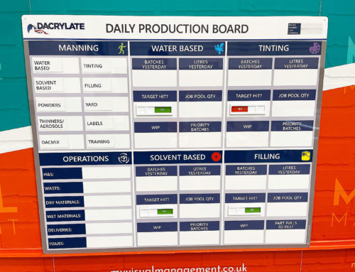
This structured visual hierarchy is what makes your KPI boards, SQDC boards and 5S layouts so easy to use.
Poor layout = visual clutter = disengagement.
3. What Research Shows About Visual Controls (2024–2025)
Recent studies demonstrate that:
-
Teams respond faster to deviations when colour-coded signals are used
-
Standard layouts reduce “visual friction” and improve sustained behaviour
-
Icon-driven systems outperform text-heavy systems in multi-shift environments
-
Mixed visual cues (colour + icon + layout) are more effective than text-only systems
This is why Lean thinking emphasises:
Make abnormality visible, instantly, without explanation.
4. Practical Applications in the Workplace
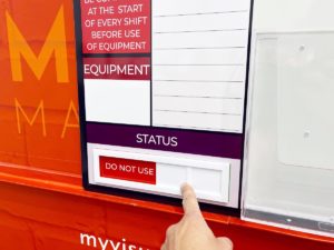
Status indicators
Quick visual cues for:
-
Machine running / stopped
-
Daily status
-
Cleaning compliance
-
Safety conditions
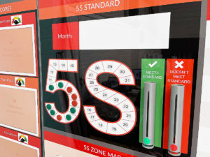
5S Board Layouts
Combine colour + icons + outline shapes.
Board should show: What good looks like.
KPI & CI Boards
Use visual performance zones (green/yellow/red) instead of raw numbers.
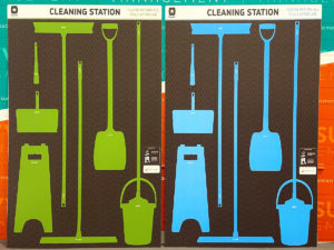
Cleaning Stations
Colour-coded tools paired with icon labels reduce search time and errors.
This is where My Visual Management adds value — you design the visuals in, not bolt them on later.
5. Designing Behaviour-Shaping Visuals: A Simple Framework
Use the “3-C Rule” when designing any visual control:
Colour
Use consistent colour rules across all boards and stations.
Intuitive
One icon = one meaning. Avoid mixed signals.
Consistency
Use the same shapes, icon style, fonts and zone markings everywhere.
If operators must think about a visual, it has already failed.
6. Key Takeaways
-
Visual controls are behavioural systems, not decoration.
-
Colour, icons and layout work best together, not separately.
-
The aim is not aesthetics — it is predictable, reliable behaviour.
-
When designed well, visual controls reduce errors, speed up response time and improve ownership.
Conclusion
Visual controls only work when they are designed with human behaviour in mind — not copied from a template or overloaded with text.
Done well, they make continuous improvement inevitable.
That’s why every board we build is designed to be “At a glance” Seen, understood and acted on in under 5 seconds.
Making Continuous Improvement Visual.
Instant visibility
Be clear, at a glance
Use red and green status for clear visual status
Make standards visual
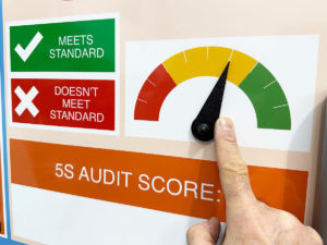
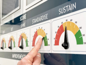
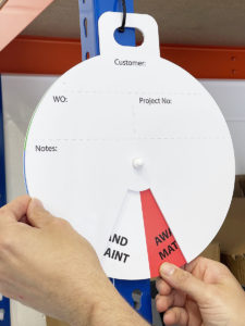
Status meters are visually effective
Use colour coding
Benefit from flexible and engaging visual tools

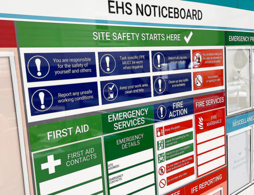
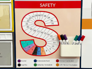
Allergen control colour coding
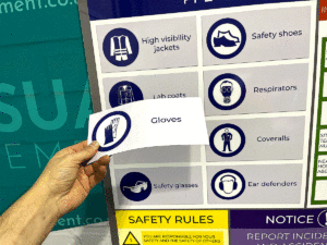
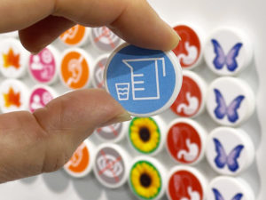
Iconography is effective for PPE
Flexible dry wipe colour coded visual control
Add text for specific messaging
Symbols save time to comprehend
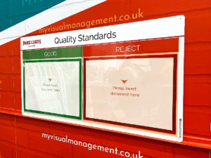
Red / Green for clear quality control
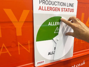
Line based allergen control for at a glance reference
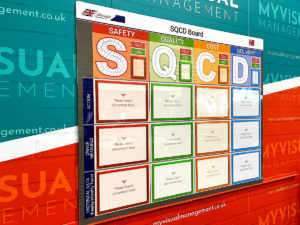
Building information architecture using colour
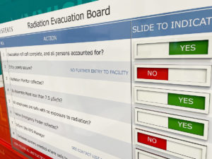
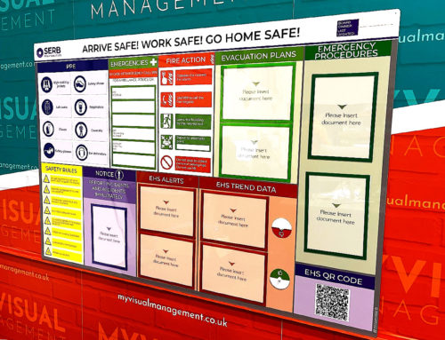
Evacuation process using visual coding
Hanging visual controls
Further examples


Product 5S board
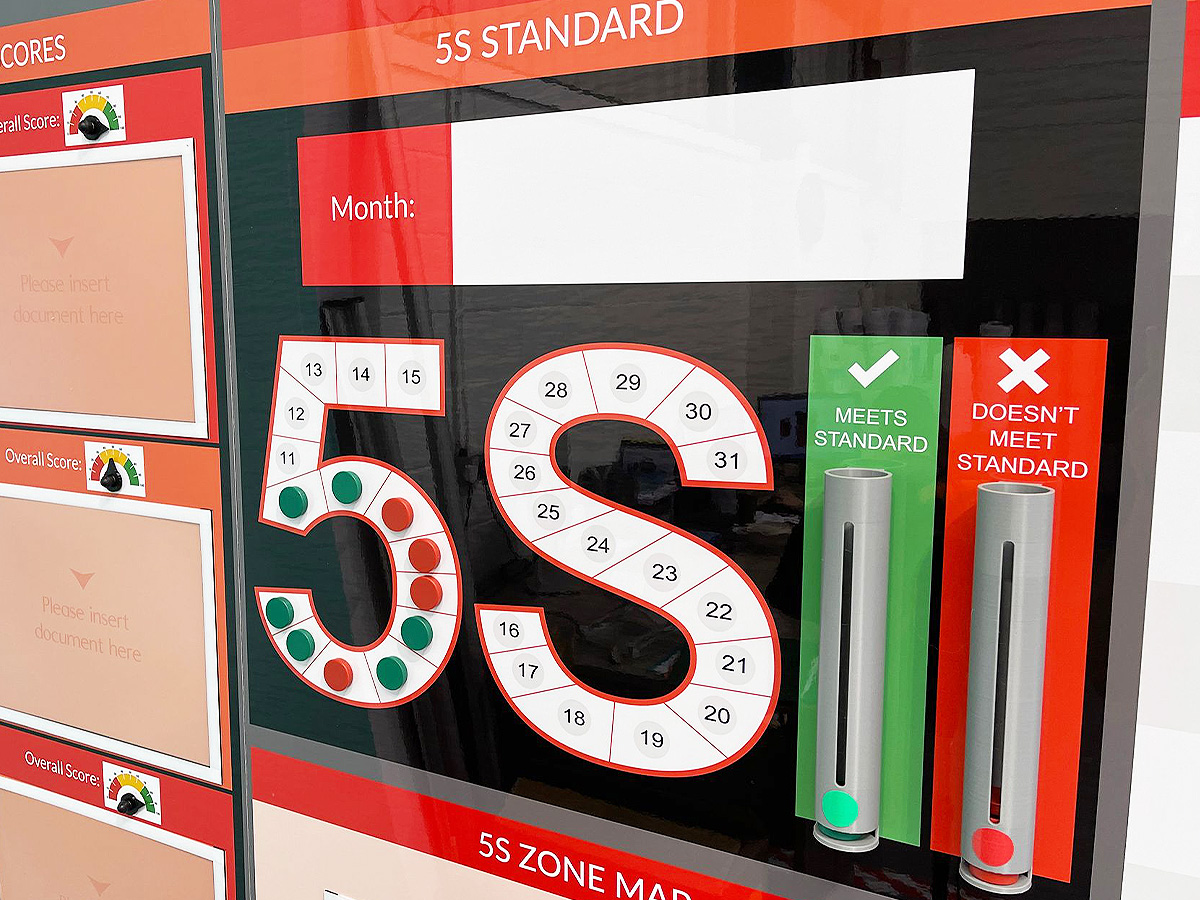
5S magnetic counters and dispensers

Product 5S board

5S board with status counters

5S & Safety Audit board

5S board with document holders

5S Management Board with dry wipe
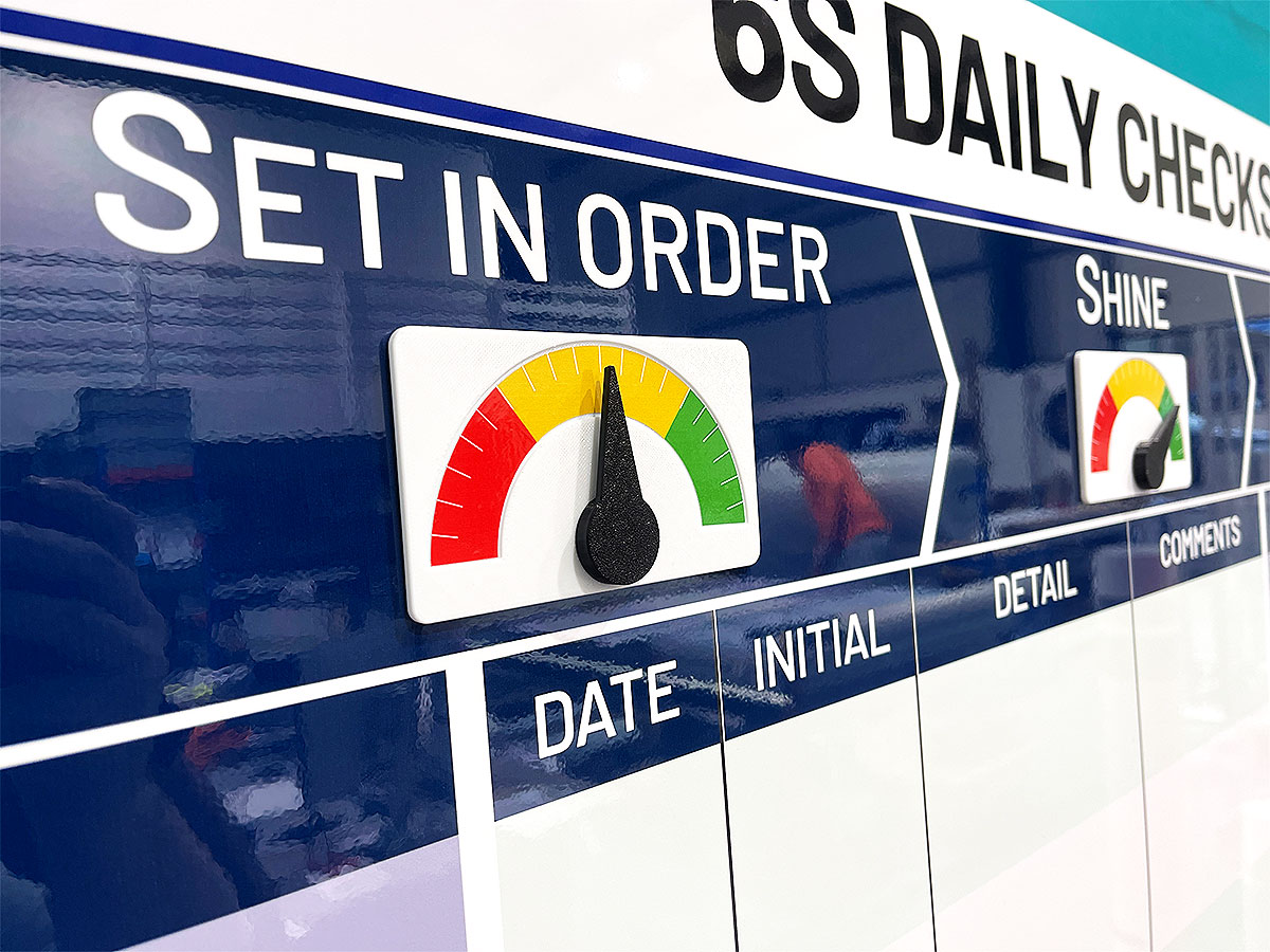
Set In Order status meter
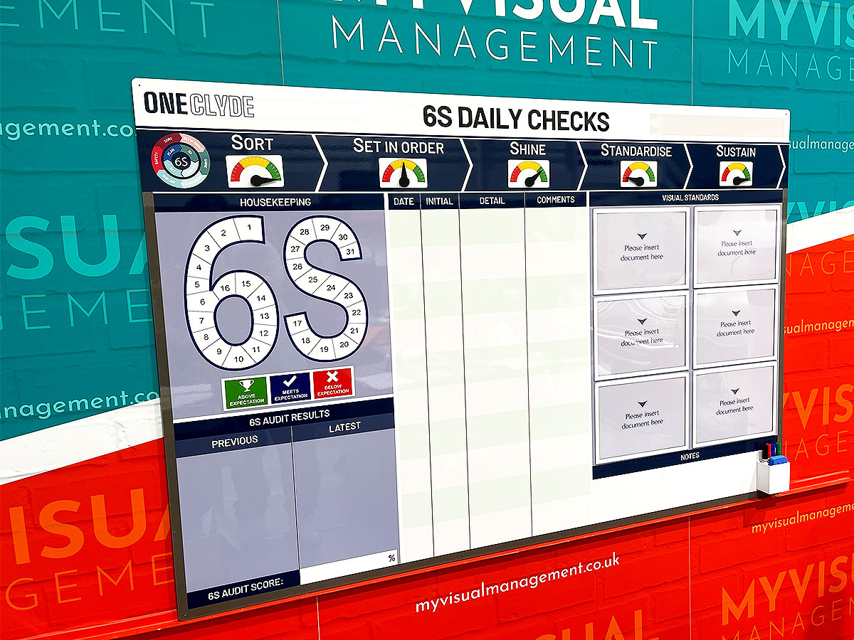
6S Daily Checks

Production Area 5S Noticeboard

5S board

5S status meters

Performance with 6S

5S Noticeboard

KPI board with modular 5S magnetics

5S Audit Board
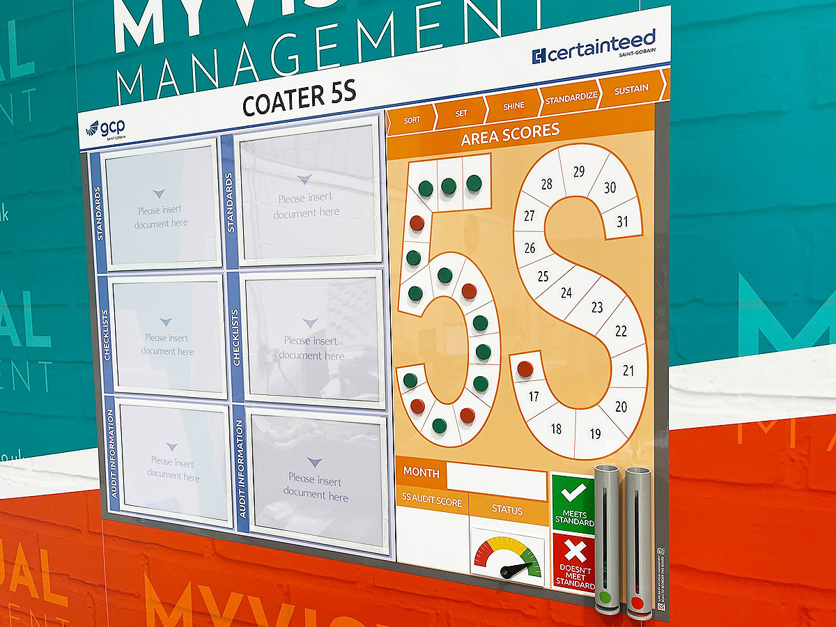
5S Board with status counters

5S Noticeboard

5S Scoreboard
KPI board with modular 5S magnetics

6S audit board

6S board

5S board
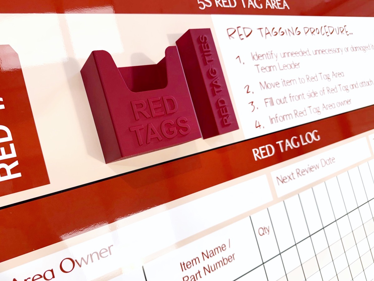
Red Tag procedures

5S dry wipe status

Document holders for visual standards

5S Production board

Red and green status counters

5S board with red and green holders

5S Sustainment board

Signs to support 5S

5S Scoreboard

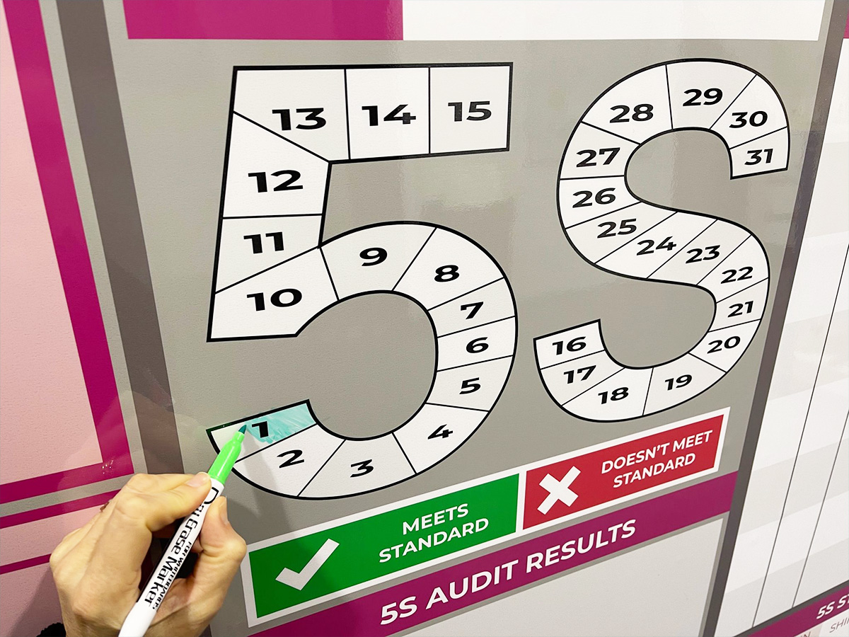
5S Audit daily tracking pyramid

5S Before & After

Show your 5S visual standards

Signs to support 5S

5S Performance Board

5S Scoreboard

5S Sustainment Status board

Track 5S and Safety

6S Communications

6S visual standards and audit board

Show your 6S visual standards

Update visual standards easily

Spell put your 5S vision

Define 5S terms for your team
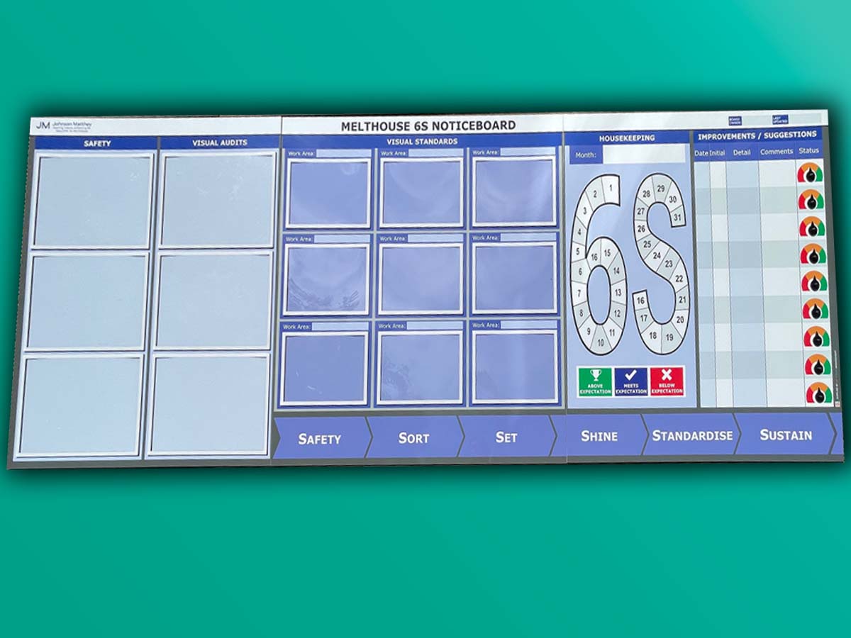
6S Noticeboard

Track your progress with status meters

6S Communications with dry wipe status
Add card and document holders

Add document holders
6S Performance Tracker

Before & After for 5S

Create a 5S task list

Chart progress with status meters

6S board with status meters

5S Noticeboard for manufacturing

Status meters 5S board

Dry wipe status 5S board

Make 5S visual

Dry wipe updates for 6S

Dry eraze updates for 5S

Use status meters to show 5S progress

5S Sustainment Board

Record 5S progress

5S Audit and Results board
Dy wipe update daily metrics

Status meters provide visual snapshot

Show your 5S audit and visual standard

Show current status with meters

Show status for each 5S metric

Red Tag station board

Triple shift pattern for 5S

Add document holders to your 5S board

Dry wipe status and document holders

Use dry wipe for easy updates

Status meters and dry wipe

Update with dry wipe pens

Use colour in your 5S design

Show your visual standards

Make your 5S board modular
Icons for 5S

Add status dials to your 6S board

Magnetic needle for your status meters

5S on a Kaizen board

6S option

Integrate 5S with Kaizen

Dry wipe status on your 5S board

Magnetic labels for visual status

Manufacturing 5S board

Add document holders to your 5S board

SQD/5S with magnetic status faces

Mark your floor for safety

Works everyday of the month

Instant updates with status dials
Our Approach
We create visual management boards everyday. As a result we have plenty of experience. We work for organisations in food production, the power industry, national rail, pharmaceuticals, education, healthcare, packaging and distribution.
Our team works with a simple idea or sketch and creates a professionally designed layout. This is then turned into a highly functional visual management board.
We offer customised options because we want to create the perfect board for you. So, here are a few examples. We can add magnetic areas or a dry-wipe finish (for use with whiteboard pens). Furthermore, you can choose Red/Green sliders or R.A.G. (Red, Amber, Green) status dials so you can quickly and visually update your board. These are just a few examples of the ways in which our boards can be tailored to meet your needs. You may also be interested in whiteboard overlays that can be used on top of an existing magnetic board.