Continuous improvement only works when people can see what’s happening, understand what’s expected, and recognise progress. When improvement is invisible, it quickly loses momentum. This is why organisations use visual management to make continuous improvement part of everyday work.
Below are the key principles for making continuous improvement visual, supported by practical examples used in real workplaces.
Key Principles for Making Continuous Improvement Visual
1. Make Performance Visible at the Point of Use
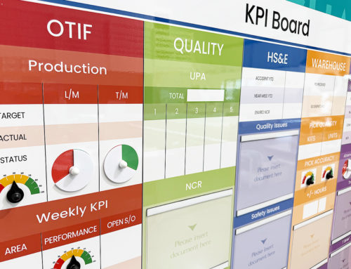
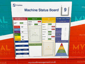
Continuous improvement starts with understanding current performance. Visual displays of KPIs, targets, and trends allow teams to see how they are performing in real time, directly in the work area.
When performance is visible, conversations happen naturally and issues are identified earlier.
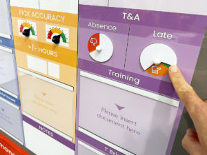
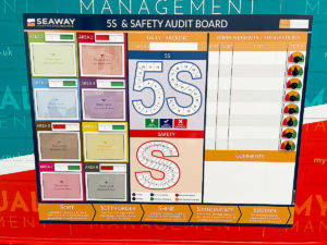
2. Clearly Show What “Good” Looks Like
Visual standards help remove ambiguity. Whether it’s safety, quality, or process compliance, showing what “good” looks like makes expectations clear and consistent.
This reduces variation and supports sustainable improvement.
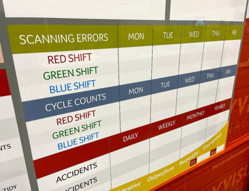
3. Highlight Problems, Not Just Results
Improvement depends on identifying problems early. Visual management makes issues stand out rather than hiding them in reports.
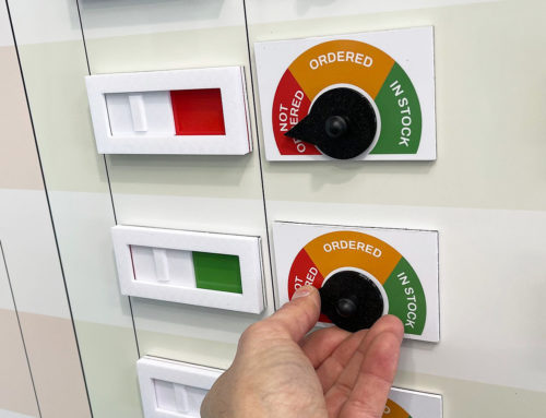
Escalation areas, RAG indicators, and trend displays help teams focus on what needs attention before problems grow.
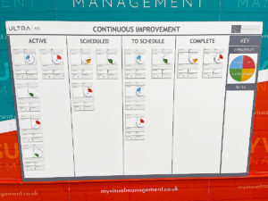
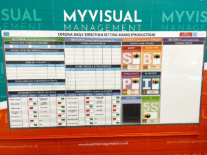
4. Make Actions and Ownership Visible
Continuous improvement stalls when actions are unclear. Visual task tracking shows:
-
What needs to be done
-
Who owns it
-
When it’s due
This transparency supports accountability and follow-through.
5. Support Daily Review and Communication
Visual tools work best when they support regular discussion. Boards designed for daily or weekly reviews encourage teams to talk about performance, risks, and improvement opportunities as part of normal routines.
This helps embed continuous improvement into everyday work.
6. Make Improvement Progress Easy to See
Seeing progress builds momentum. Tracking completed actions, closed issues, and positive trends reinforces improvement efforts and keeps teams engaged.
Visual progress helps improvement feel achievable rather than overwhelming.
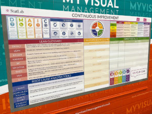
7. Keep Information Simple and Relevant
Effective visual management focuses on what matters most. Too much information reduces impact.
Clear layouts, simple language, and relevant measures ensure teams engage with the information rather than ignoring it.
8. Make Improvement Visible to Everyone
Continuous improvement should not sit with a single role or team. Visual management makes improvement accessible to operators, supervisors, managers, and visitors alike.
Shared visibility encourages shared ownership.
9. Design for Change, Not Perfection
Continuous improvement is never finished. Visual systems should be easy to update, adapt, and evolve as processes improve and priorities change.
Boards that are flexible support long-term improvement rather than short-term fixes.
10. Align Visual Management with Business Goals
The most effective visual systems link daily activity to wider organisational goals. When teams can see how their improvement efforts contribute to safety, quality, delivery, or cost, engagement increases.
This alignment keeps improvement focused and meaningful.
Final Thoughts
Making continuous improvement visual transforms improvement from an abstract idea into a practical, everyday activity. When performance, problems, and progress are visible, teams are better equipped to identify issues, take action, and sustain improvements over time.
Visual management doesn’t replace continuous improvement — it enables it.
Encourage interactive and engaging continuous improvement
Be clear, at a glance
Support best practice Continuous Improvement
Put visual support in at the place, for example with line boards
Make your CI efforts visually engaging and accessible
Make your visual management board your single source of truth
Create a real-time visual dashboard
Rely on coherent visual management where all you need is in one place

Provide a dedicated area where teams and colleagues can successfully perform
Benefit from flexible and engaging visual tools
Further examples


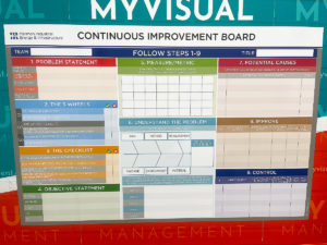
Short Interval Control board

Continuous Improvement steps

CI Kanban board with status tickets

Continuous Improvement strategy board

QMS Overview Board

Theatre Improvement Board

CI foreign langauage board

Continuous Improvement status

Concerns Board

Complaints board

Short Interval Control

Continuous Improvement board

Short Interval Control

PDCA board

Use status circles for updates

Kaizen for KPI tracking

Line Continuous Improvement

Kanban Continuous Improvement

Dry wipe status circles

Plan Do Check Act status dial

Processes for Continuous Improvement

Kaizen for Continuous Improvement

Loss Elimination Board

Colour coding Continuous Improvement

Colour code your Plan Do Check Act

Show your targets

Plan Do Check Act Board

Continuous Improvement Process Board

Use colour for Continuous Improvement

Use colour in your 5S design

Kaizen room meeting schedule

Lean environment strategies

The PDCA cycle visually

Show Continuous Improvement visually

Plan Do Check Act status dial

Kaizen PFU boards

Errors Board

Short Interval Control Board

Kanban Continuous Improvement

PDCA cycle

Show your processes

Track daily progress

Workstream whereabouts CI

SIC status board

Track customer feedback performance

Add status dials to your 6S board

Update progress with status meters

Plan Do Check Act board

Use the Plan Do Check Act cycle

Food Production CI

KATA Improvement

Plan Do Check Act

Track targets as a department

KPI board with document holders

Practical Problem Solving board

Visual Management with status dials

Status dials with percentages

Use dry wipe status indicators

Quality Station Continuous Improvement
Our Approach
We create visual management boards everyday. As a result we have plenty of experience. We work for organisations in food production, the power industry, national rail, pharmaceuticals, education, healthcare, packaging and distribution.
Our team works with a simple idea or sketch and creates a professionally designed layout. This is then turned into a highly functional visual management board.
We offer customised options because we want to create the perfect board for you. So, here are a few examples. We can add magnetic areas or a dry-wipe finish (for use with whiteboard pens). Furthermore, you can choose Red/Green sliders or R.A.G. (Red, Amber, Green) status dials so you can quickly and visually update your board. These are just a few examples of the ways in which our boards can be tailored to meet your needs. You may also be interested in whiteboard overlays that can be used on top of an existing magnetic board.