Making Continuous Improvement Visual: What the Latest Research Says About Visual Management (2024–2025)
By My Visual Management
Visual management isn’t just a shop-floor nicety — it is increasingly supported by empirical research across manufacturing, healthcare, construction and safety environments. In this article, we collate latest insights (2024–2025) to show what works, why it works, and how to apply it in real settings (with your boards, status indicators, 5S zones and so on). As a result, see how to implement best visual management based on latest findings.
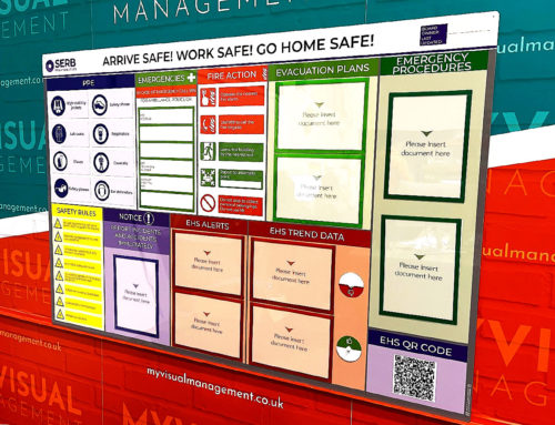
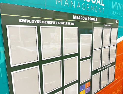
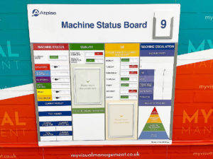
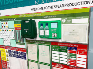
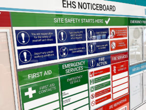
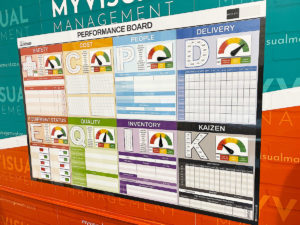
1. Visual boards strengthen daily accountability and problem visibility
Key insight
One of the clearest findings is that visual management boards (VMBs / huddle boards) help bridge the gap between frontline staff and leadership, making problems visible. Therefore, enabling daily problem-solving.
Supporting evidence
- A 2024 implementation study in a U.S. healthcare system showed that VMBs are inexpensive but powerful tools to engage staff in solution development, raise issues early, and communicate status upward. (PMC, 2024)
- In construction settings in Peru, an exploratory study found that sites with stronger visual management and transparency practices had measurable improvements in team performance, particularly in reducing rework and defects. (ResearchGate, 2024)
Practical implications
- Firstly, use a consistent daily huddle at the VMB location.
- secondly, display deviations (yesterday vs plan), open tasks, outstanding actions.
- In addition, assign visible ownership (name + date) of issues.
- Resist overloading the board — a few critical metrics is better than many ignored ones.
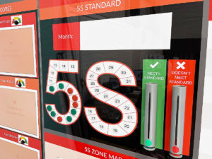
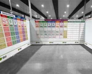
2. Design — layout, colour, icons — matters more than we often think
Key insight
How a board looks — the visual grammar — influences how quickly people grasp it, what they remember, and how faithfully they act on it.
Supporting evidence
- In a study using eye-tracking with construction workers, features like colour and shape had significant effects: e.g. red and rectangular signs reduced cognitive load. Meanwhile, “unfamiliar” symbols required more processing time. (MDPI, 2022)
- Broader work on visual attention and neural processing also underscores that surrounding shapes (frames, borders) influence how we interpret interior symbols — meaning careful layout is not cosmetic but cognitive. (ScienceDirect, 2024)
- A systematic literature review in 2025 on business process visualisations also highlights the importance of user-centred design: visuals should engage cognition without overwhelming it. (arXiv, 2025)
Practical implications
- Reserve bright or saturated colours for alerts, thresholds, or exceptions.
- Use consistent icon sets across boards/areas.
- Enforce strong visual hierarchy: headline, metric, trend, action.
- Place boards or visuals so they are readable from typical team standing positions. For example, 2-3m away.
- Test your visuals: show to someone unfamiliar and ask them to explain it in 60 seconds.
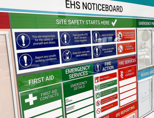
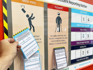
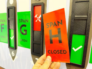
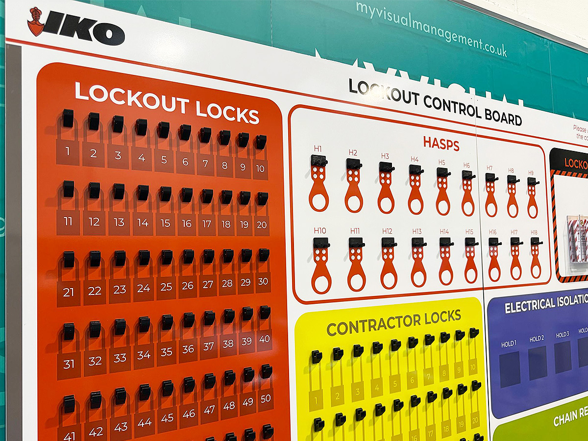
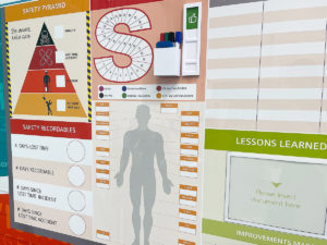
3. Visuals improve safety by guiding attention, reducing errors, and enabling faster decisions
Key insight
Visual cues are not just reminders — they bias attention, reduce cognitive load, and sometimes act as automatic prompts that mitigate risk.
Supporting evidence
- A 2025 safety study in immersive construction settings examined the impact of proactive warning systems; these visual cues significantly improved safety performance (fewer near misses) compared with static signage. (ScienceDirect, 2025)
- More broadly, research in manufacturing safety shows that implementing visual management tools correlates with greater awareness of hazards and reductions in accidents. (ResearchGate, 2023)
Practical implications
- Place visual cues at the point of decision or hazard, not just at entrances or generic zones.
- Use simple, clear verbs (“Stop • Isolate • Test”) and standard icons.
- Audit and remove outdated or duplicated signs weekly — clutter dilutes impact.
- Align all safety visuals with recognised standards (e.g. ISO 3864, ANSI/ISO symbol standards) to reduce misinterpretation.
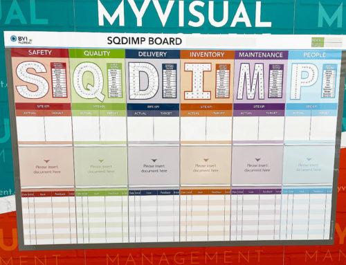
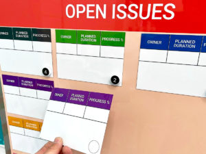
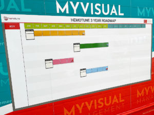
4. Kanban, flow boards, and hybrid work contexts — visuals help manage complexity
Key insight
As workflows get more flexible (especially with hybrid or cross-functional teams), visual flow (Kanban) boards help maintain clarity, limit WIP (Work in Progress), and highlight bottlenecks.
Supporting evidence
- Kanban boards, with columns for “to do / doing / done” and explicit WIP limits, remain a widely accepted visual method for flow management. (Industry reviews, 2024)
- Recent academic reviews of business process visualisations emphasize that visual flow tools help reduce “invisible work” and improve organizational effectiveness. (arXiv, 2025)
Practical implications
- Impose WIP (Work in Progress) limits visibly — e.g. no more than 3 items allowed in “Doing” at one time.
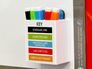
- Highlight blockers visually , for example use a counter status system, along with owner and date.
- Blend Kanban boards with daily huddles — review flow metrics (lead time, throughput).
- When digitising, maintain a mirror — the physical board should match screen views where possible, reinforcing trust and consistency.
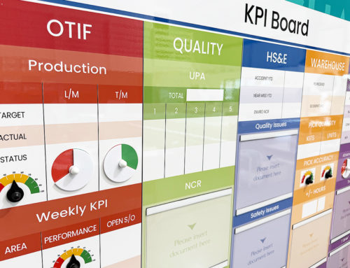
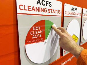
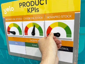
5. The rise of smart visuals: integrating sensors, dashboards & hybrid data
Key insight
Visual management is evolving beyond whiteboards: the latest trend is boards that act — dashboards + sensor triggers + alerts feeding frontline visuals. For example, status indicators.
Supporting evidence
- In manufacturing research, “Visual Management for digitizing production scheduling” describes embedding visual techniques into real-time dashboards. (ScienceDirect, 2025)
Practical implications
- Start small: pick one pilot line or cell.
- Configure thresholds/alerts so that when a metric nears limit, a status indicator flags.
- Use the board as the single source of truth — avoid conflicting dashboards or shadow systems.
- Ensure visuals remain human-centred: a red flag must lead to a clear next action
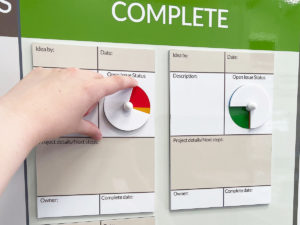
6. Co-creation, literacy, and adoption — the “soft” enablers that make visuals stick
Key insight
Even the best visual board fails if people don’t use it. Research from fields like healthcare and change management show that co-design with teams and applying visual literacy principles drastically improve adoption and retention.
Supporting evidence
- In healthcare visual management, co-designed boards with frontline staff produce higher adherence, fewer corrections, and more sustained usage. (PMC, 2024)
- Research in construction and lean contexts shows that visual management is more effective when staff feel ownership over the visuals, not just as passive viewers. (ResearchGate, 2024)
- The literature on business process visualisations highlights the importance of usable visualization — meaning visuals must align with end users’ cognitive models and context. (arXiv, 2025)
Practical implications
- Run sketch & stick sessions: bring the team, ask them to draft what they want to see on the board.
- Use teach-back: after building, ask someone to explain the board in their own words.
- Pilot the board for one week, observe — then iterate. Don’t let a “draft” live in perpetuity.
- Provide a simple maintenance guide: who updates, when, how often, and checks for clarity.
Practical checklist & rollout flow
Here’s a quick checklist and suggested rollout sequence to tie the research into action:
| Step | Action | Notes |
|---|---|---|
| 1 | Define decision use | What decisions will this board support (e.g. safety, throughput, maintenance)? |
| 2 | Choose 3–5 metrics | Focus on what matters most; less is more. |
| 3 | Layout & design | Use consistent colours, icons, and hierarchy. |
| 4 | Co-design with team | Sketch + feedback loop before final build. |
| 5 | Pilot & observe | One week is good. Note confusion, unused sections. |
| 6 | Adjust & stabilize | Lock in structure, ownership, cleanup. |
| 7 | Scale & integrate | Clone into other areas, integrate with dashboards. |
| 8 | Maintain cadence | Daily huddles, weekly review, visual sweeps. |
Summary & next steps
Visual management is not static — the evidence is evolving. What remains constant is that clear, relevant, and human-centred design matter more than decoration. The best visuals are those that:
- Make problems visible, early
- Guide people’s attention to what matters
- Minimise mental friction (layout, colour, icon design)
- Align with data systems but remain anchored in frontline action
- Are co-owned, iterated, and upheld
Encourage interactive visual management boards
Be clear, at a glance
Use red and green status for clear visual status
start on one line, machine or cell before rolling out your visual management
Make your own process visual
Make your visual management board your single source of truth
Create a real-time visual dashboard
Rely on coherent visual management where all you need is in one place
Provide a dedicated area where teams and colleagues can successfully perform
Benefit from flexible and engaging visual tools
Bring visual, functional and intuitive together
Blend familiar icons with well framed visuals for intuitive results
Making status visual and interactive is key
Colour coding is instantly comprehensible
Change documentation quickly and easily
Take concern about safety to the next level
Visually track and reference what you need
Go for bright, clean and engaging visual resonance
Make the process instantly clear and user-friendly
Further examples


CI with dry wipe status circles

Continuous Improvement steps

CI Kanban board with status tickets

Continuous Improvement strategy board

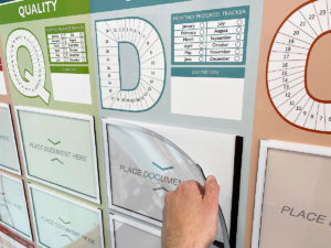
QMS Overview Board

Theatre Improvement Board

CI foreign langauage board

Continuous Improvement status

Concerns Board

Short Interval Control board

Complaints board

Short Interval Control

Continuous Improvement board

Short Interval Control

PDCA board

Use status circles for updates

Kaizen for KPI tracking

Line Continuous Improvement

Kanban Continuous Improvement

Dry wipe status circles

Plan Do Check Act status dial

Processes for Continuous Improvement

Kaizen for Continuous Improvement

Loss Elimination Board

Colour coding Continuous Improvement

Colour code your Plan Do Check Act

Show your targets

Plan Do Check Act Board

Continuous Improvement Process Board

Use colour for Continuous Improvement

Use colour in your 5S design

Kaizen room meeting schedule

Lean environment strategies

The PDCA cycle visually

Show Continuous Improvement visually

Plan Do Check Act status dial

Kaizen PFU boards

Errors Board

Short Interval Control Board

Kanban Continuous Improvement

PDCA cycle

Show your processes

Track daily progress

Workstream whereabouts CI

SIC status board

Track customer feedback performance

Add status dials to your 6S board

Update progress with status meters

Plan Do Check Act board

Use the Plan Do Check Act cycle

Food Production CI

KATA Improvement

Plan Do Check Act

Track targets as a department

KPI board with document holders

Practical Problem Solving board

Visual Management with status dials

Status dials with percentages

Use dry wipe status indicators

Quality Station Continuous Improvement
Our Approach
We create visual management boards everyday. As a result we have plenty of experience. We work for organisations in food production, the power industry, national rail, pharmaceuticals, education, healthcare, packaging and distribution.
Our team works with a simple idea or sketch and creates a professionally designed layout. This is then turned into a highly functional visual management board.
We offer customised options because we want to create the perfect board for you. So, here are a few examples. We can add magnetic areas or a dry-wipe finish (for use with whiteboard pens). Furthermore, you can choose Red/Green sliders or R.A.G. (Red, Amber, Green) status dials so you can quickly and visually update your board. These are just a few examples of the ways in which our boards can be tailored to meet your needs. You may also be interested in whiteboard overlays that can be used on top of an existing magnetic board.