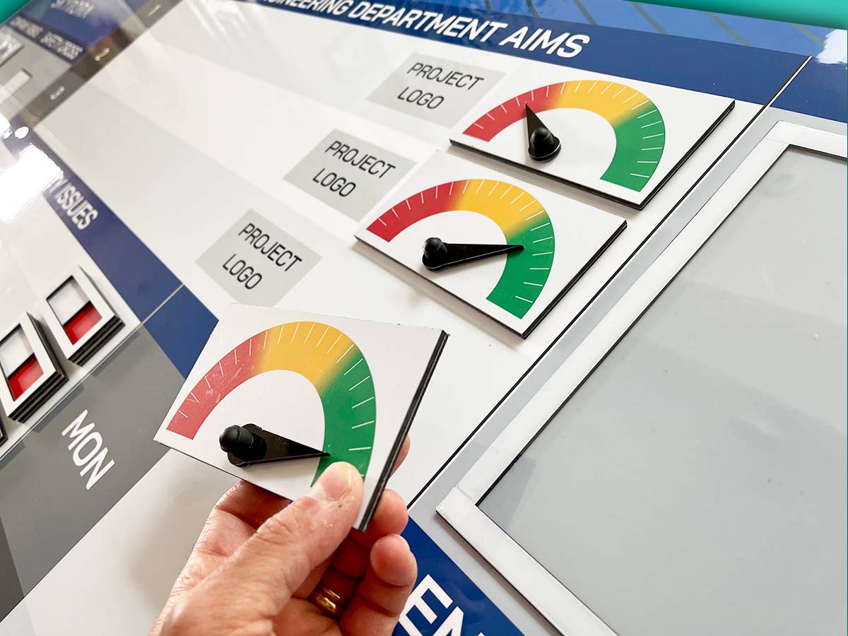
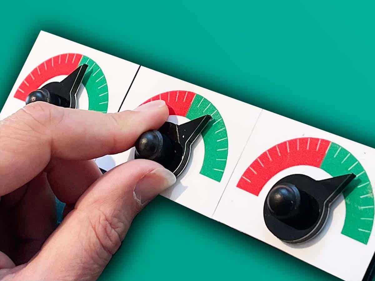
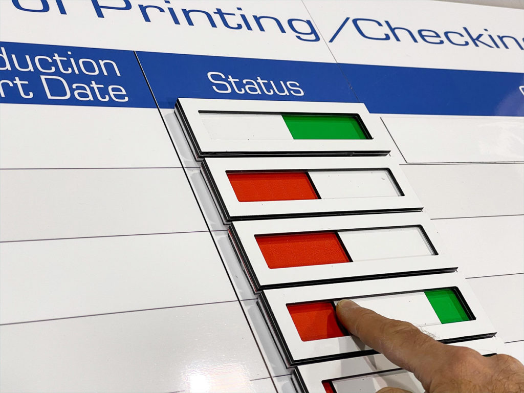
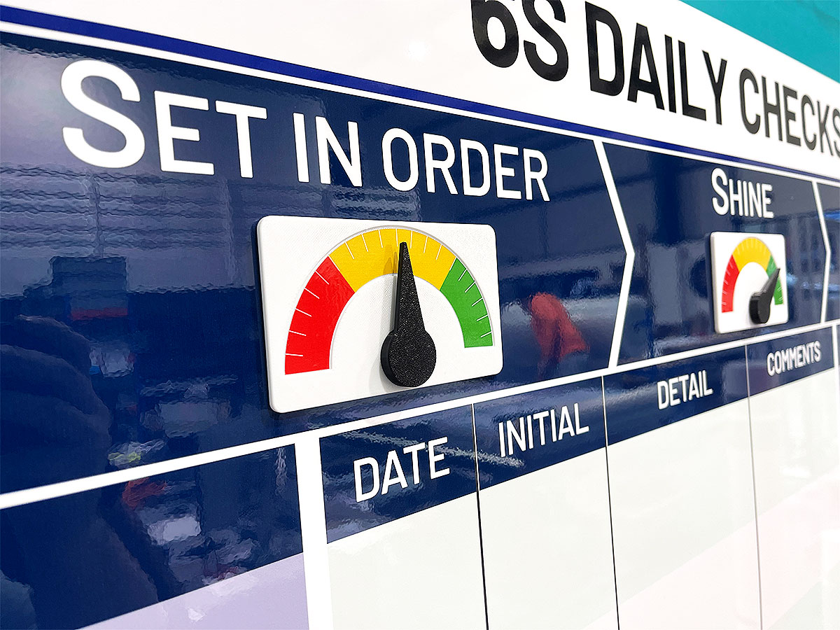
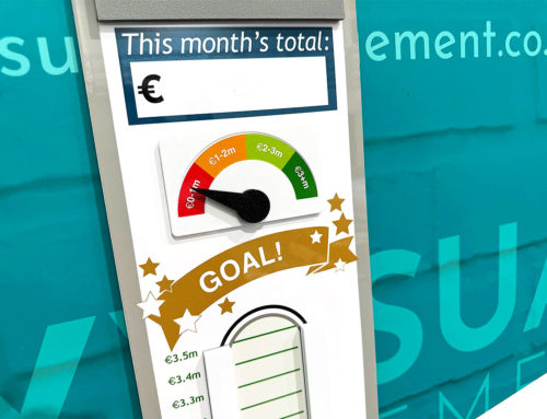
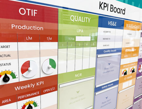
So what are visual controls? Secondly, how to they work? In short, they are visual signals that clearly prompt action, at a glance.
Above all, they are prompts that are communicated entirely visually. In other words, they are self-explanatory on sight, without further direction (spoken or otherwise) required.
How do visual controls work?
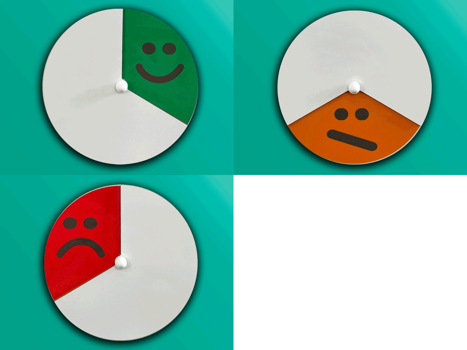
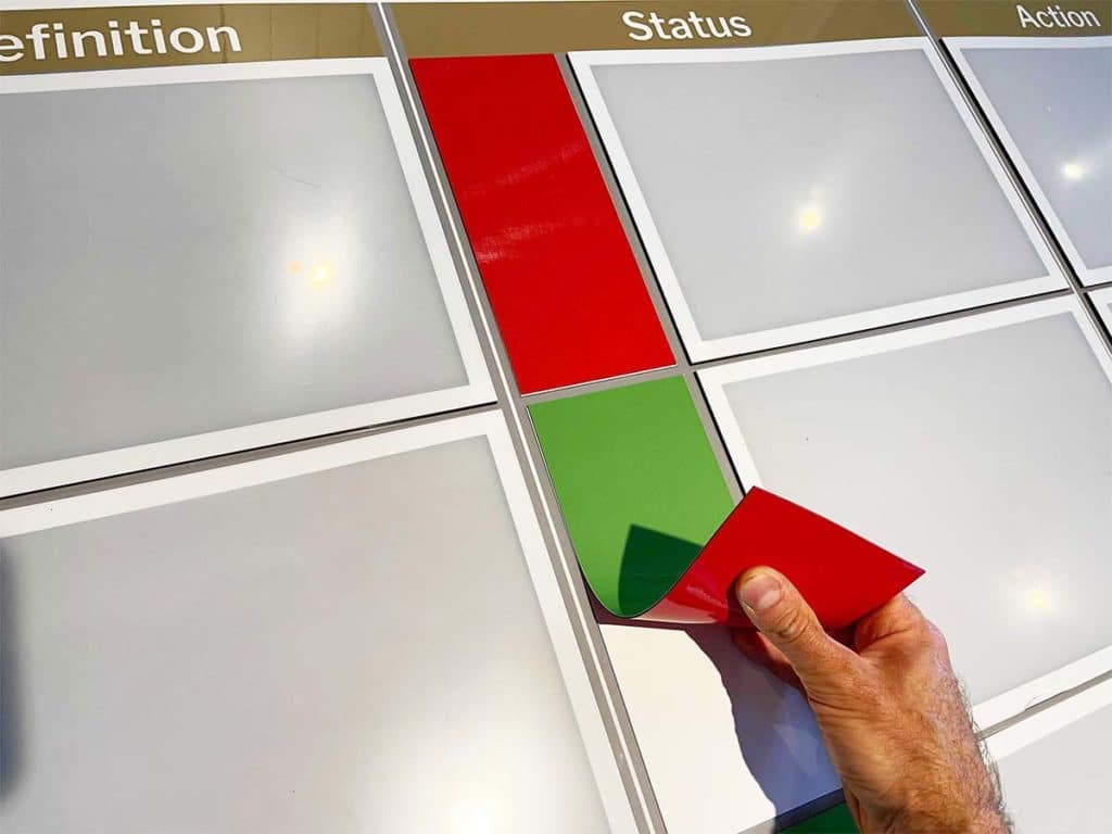
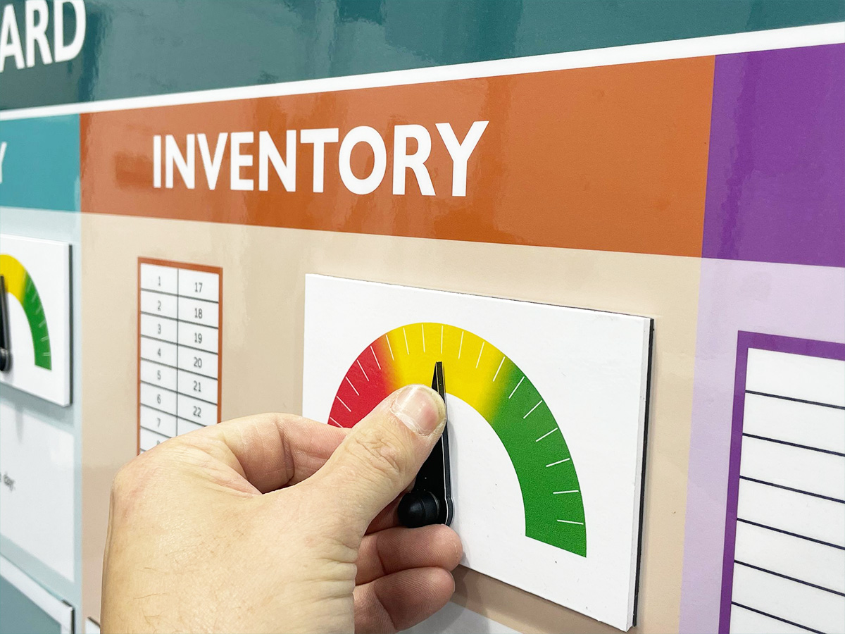
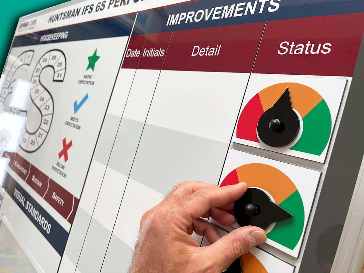
An important area of visual management, visual controls have specific tasks. So, for instance, consider Red Amber Green indicators. Each colour demands a different course of action. It could be Stop (Red), Wait (Amber) and Go (Green). Similarly, Take action (Red), Review (Amber) and Complete (Green).
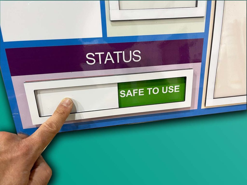
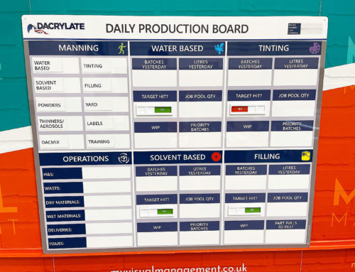
In addition, Red Green visual controls offer a binary solution. For example, “Unsafe” (Red) and “Safe” (Green).
Most importantly, Red (Amber) Green works because it provides strong visual cues. In addition, it provides a cue, often for preventive action to be taken.
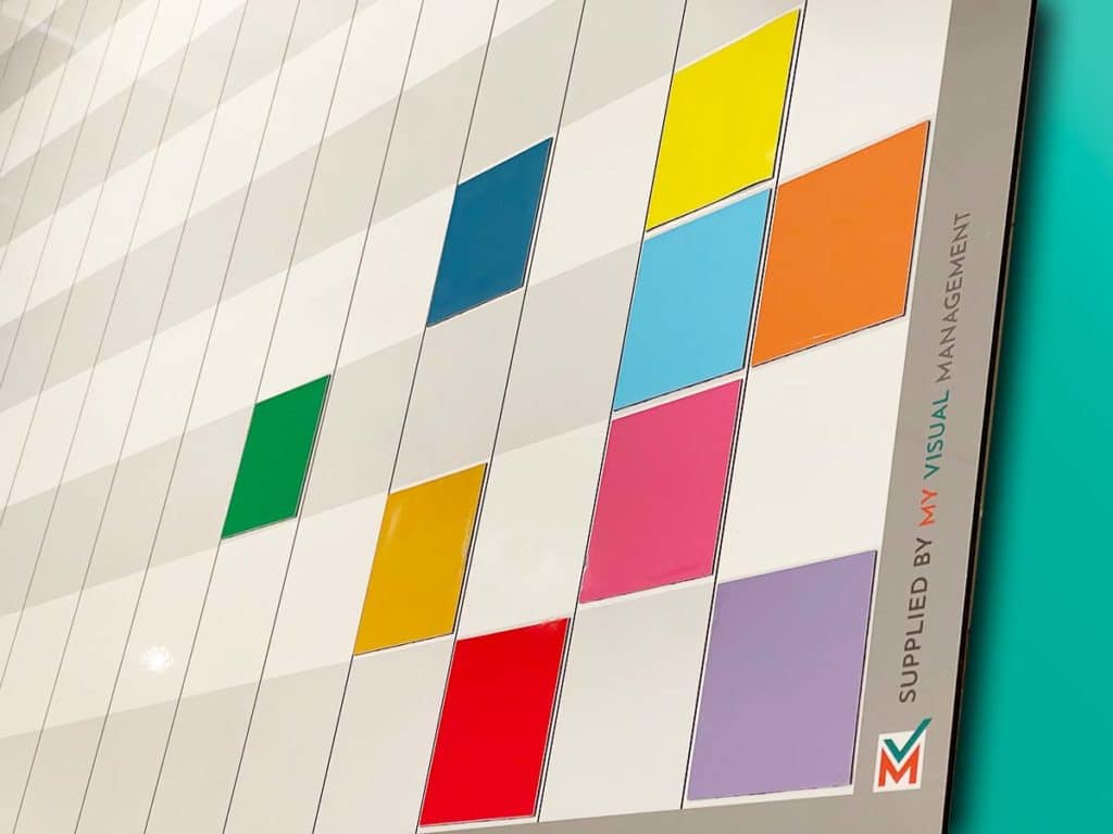
Overall, colour coding is simple, effective and accessible. It can convey when a team member needs to intervene. Likewise, when no intervention is necessary. In addition, it can, for example, prompt a safety check.
How can visual controls fail?
So an excellent rule of thumb here is to consider if additional explanation is required to know what the visual control means.
Above all, if further information is required to understand the visual control then it is not working. Similarly, if it is not providing a clear directive then it is not working. In other words, if the call to action is not obvious, at a glance.
Examples in the wider world
Beyond the workplace, visual controls exist everywhere. They are in our cars and evident at almost every place we visit. Consequently, people are well practised at successfully responding to them. As a result, they are highly effective in the workspace too. Think, for example, of traffic lights, road markings or highway signs. Consider way-finding and directional signage to the restroom. These are familiar – almost universal.
Further ideas
See our visual controls gallery
See our visual control page
Further Visual Status Indicator Meter Examples
Our Approach
We create visual management boards everyday. As a result we have plenty of experience. We work for organisations in food production, the power industry, national rail, pharmaceuticals, education, healthcare, packaging and distribution.
Our team works with a simple idea or sketch and creates a professionally designed layout. This is then turned into a highly functional visual management board.
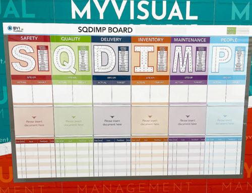
We offer customised options because we want to create the perfect board for you. So, here are a few examples. We can add magnetic areas or a dry-wipe finish (for use with whiteboard pens). Furthermore, you can choose Red/Green sliders or R.A.G. (Red, Amber, Green) status dials so you can quickly and visually update your board. These are just a few examples of the ways in which our boards can be tailored to meet your needs. You may also be interested in whiteboard overlays that can be used on top of an existing magnetic board.


