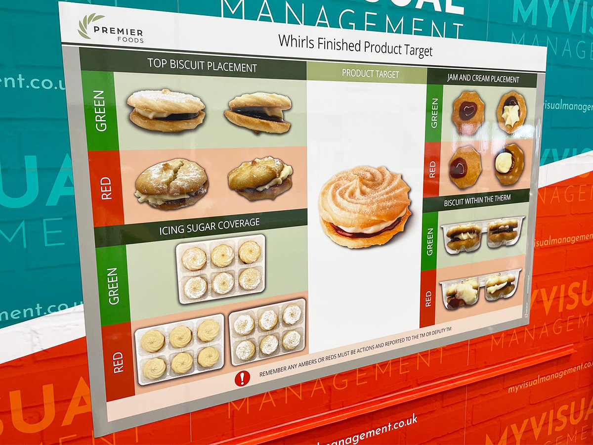
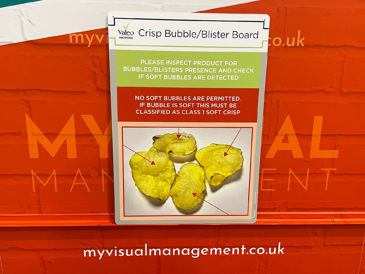
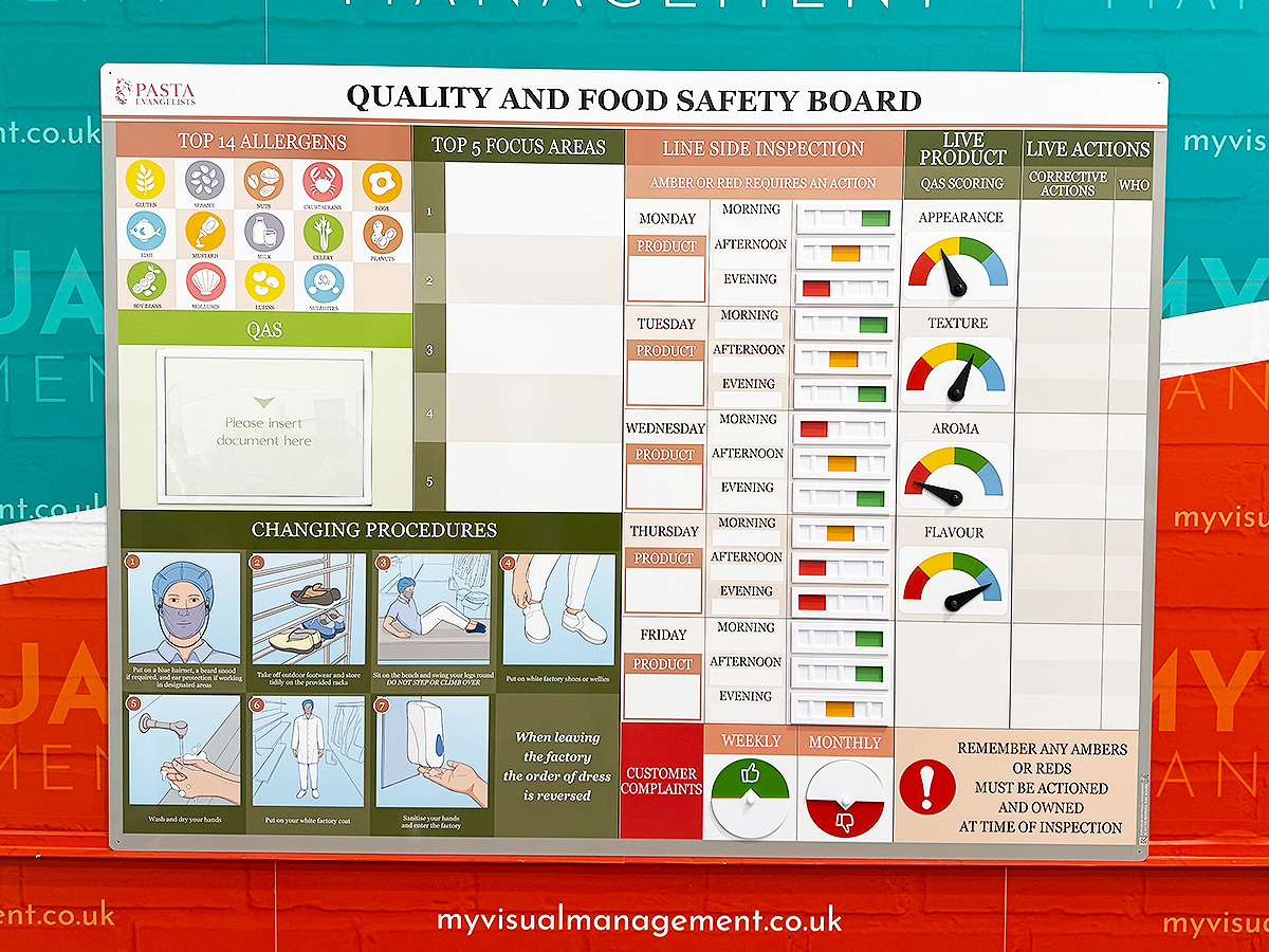
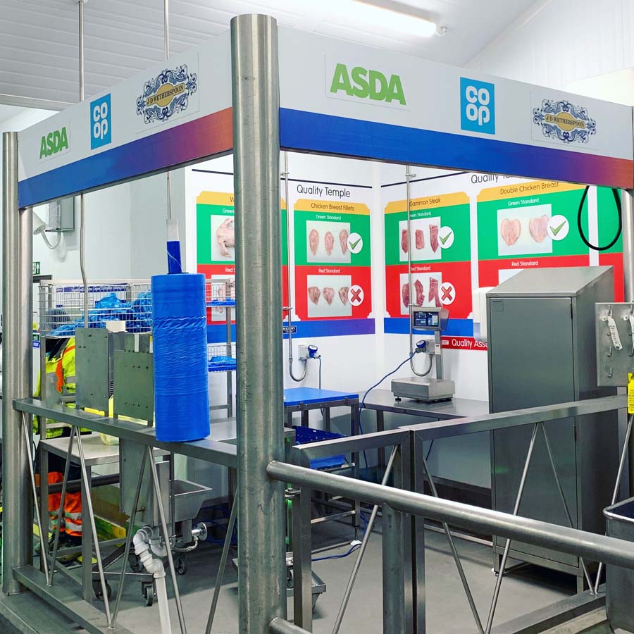
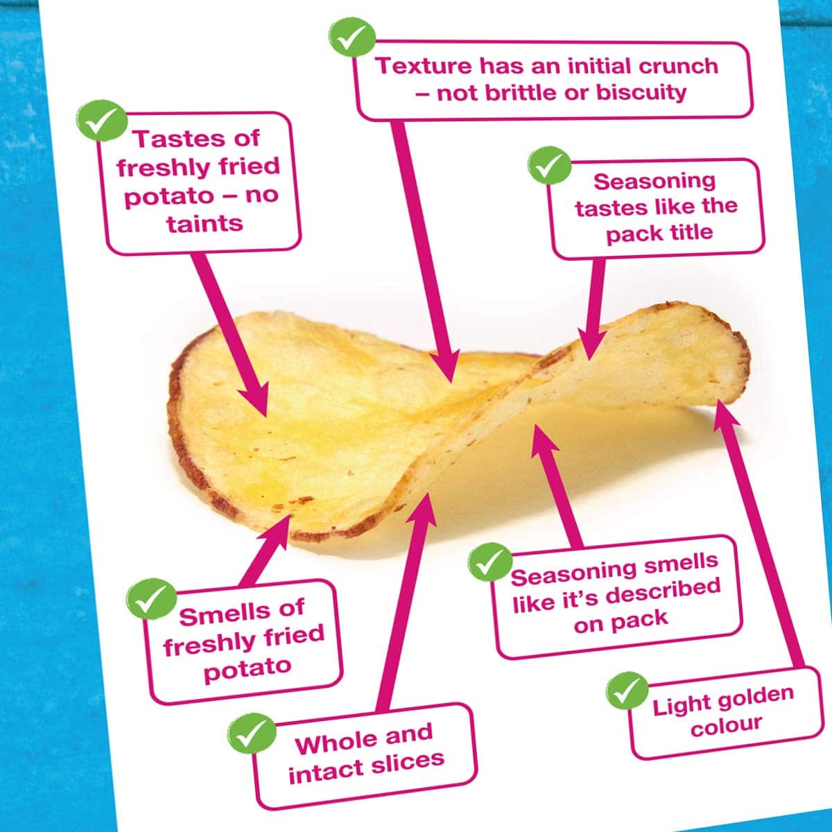
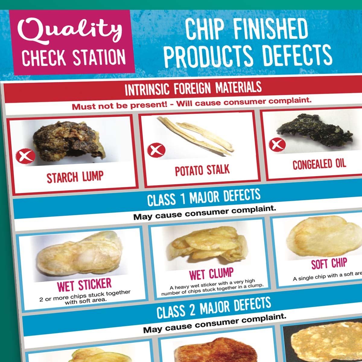
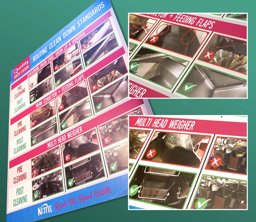
Above all, show what good looks like and how to achieve it. Furthermore, make clear what defects to avoid. So define an area where quality rules. To clarify, make a quality checkpoint near your process. Most importantly, this is where quality checks happen.
How to show what good looks like
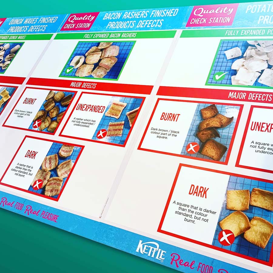
In short, show what good looks like by creating a quality check station. Above all, show your quality standards in a way that’s immediately clear. Furthermore, accessible to all, at a glance.
Most importantly, therefore show what good looks like. In other words, set your quality standard visually. Therefore, show what good looks like using pictures. Likewise, say what good is using the most relevant information. Above all, make your own quality rules clear.
How we help you to show what good looks like
We support you to make your quality standards quick and easy to understand.
In addition to showing what good looks like, it works well to show defects too. In other words, show what bad looks like. Furthermore, explain how to avoid defects. Use colour coding to help. Therefore, for example, use Green to show what good looks like. Similarly, on the other hand, use red text to show defects to avoid.
A further tip is to make your quality check station stand out. Therefore, make it outstanding! Clear, bright and engaging visuals are key.
Show what good looks like across your site
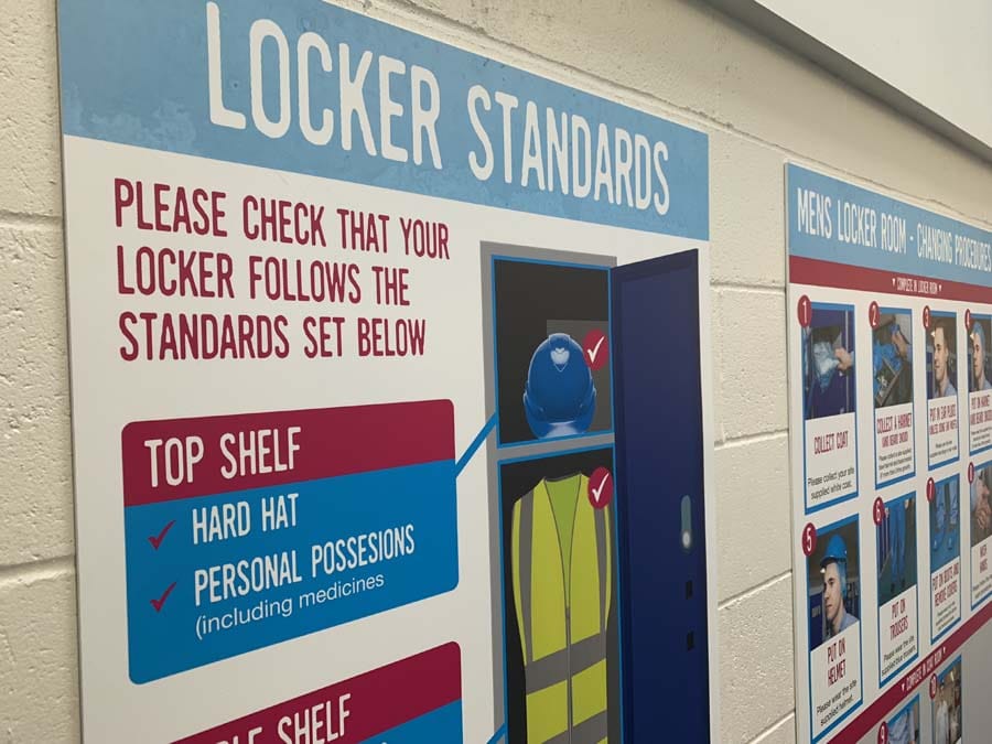
Make site wide Quality Station checkpoints. So, introduce quality stations at numerous checkpoints on site. Above all, make everyone on site aware of what good looks like. Most importantly, this works to achieve site wide quality standards.
Furthermore, give checkpoints a distinct appearance so they stand out.
Examples of our Quality Stations
Our Approach
We create visual management boards everyday. As a result we have plenty of experience. We work for organisations in food production, the power industry, national rail, pharmaceuticals, education, healthcare, packaging and distribution.
Our team works with a simple idea or sketch and creates a professionally designed layout. This is then turned into a highly functional visual management board.
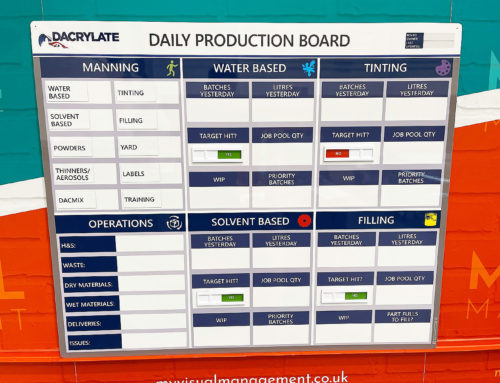
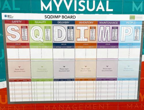
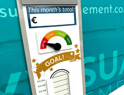
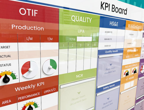
We offer customised options because we want to create the perfect board for you. So, here are a few examples. We can add magnetic areas or a dry-wipe finish (for use with whiteboard pens). Furthermore, you can choose Red/Green sliders or R.A.G. (Red, Amber, Green) status dials so you can quickly and visually update your board. These are just a few examples of the ways in which our boards can be tailored to meet your needs. You may also be interested in whiteboard overlays that can be used on top of an existing magnetic board.


