Visual Prompts
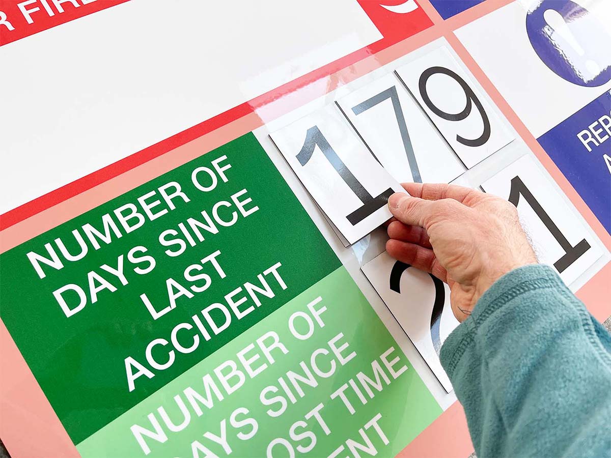
Visual management delivers Health & Safety in a number of ways. Firstly, it makes targets visible. Likewise, at a glance. In other words, visual management serves Health & Safety because it gives visual prompts. Therefore show your safety targets. In addition, make it clear when to take action.
More than just Health & Safety signs, visual management delivers a professional approach to Health & Safety communications. In addition, this works across your site. Firstly, at entrances and exits. Secondly, anywhere that Health & Safety procedures are in place. Likewise, at further custom check stations. Above all, make these anywhere within your setting. For example, on gates, doors or before entering critical areas.
Below are specific ideas for how visual management delivers Health & Safety targets.

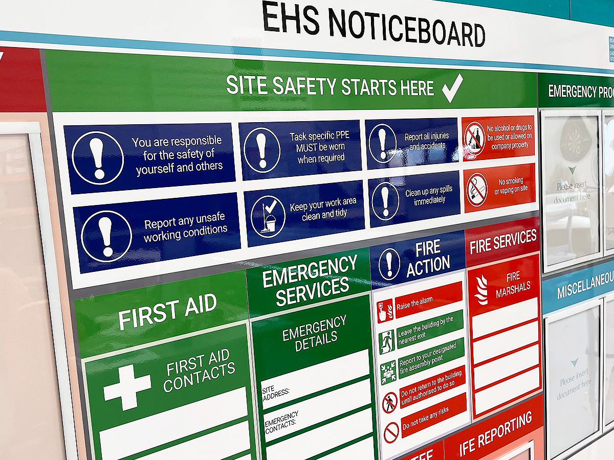
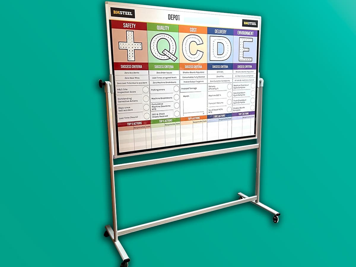
Choose which Health & Safety information to show on your board
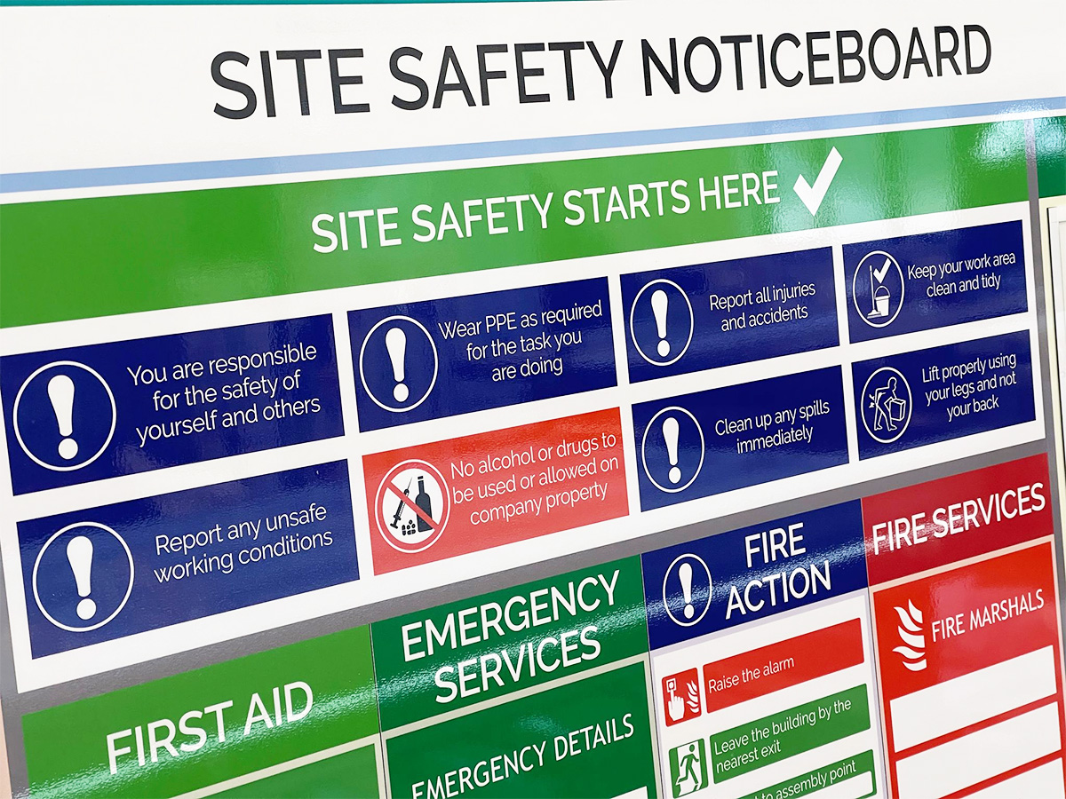
Most importantly, make your health & safety procedures visual

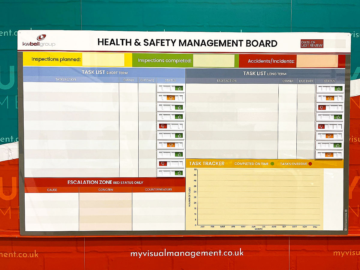
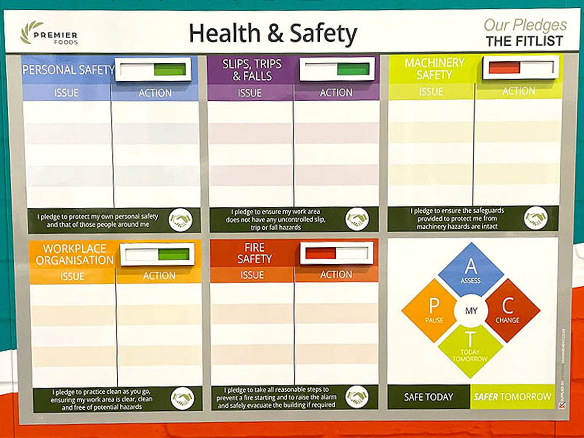
Status indicator sliders for safety boards
Status indicator sliders for safety
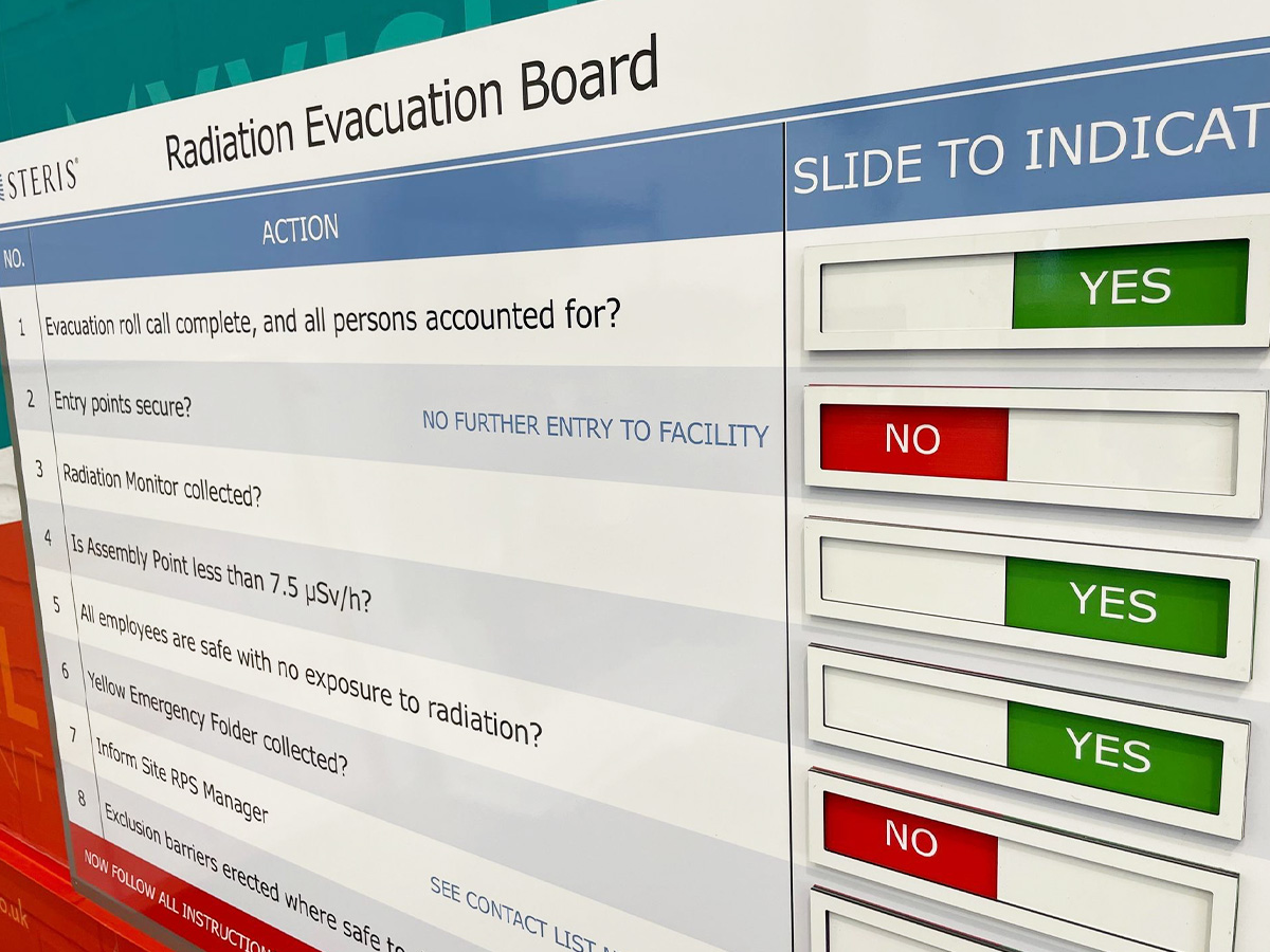
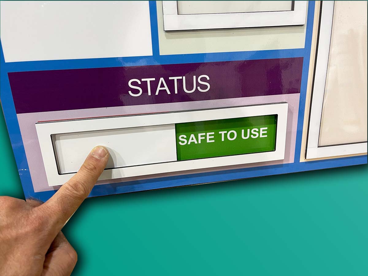
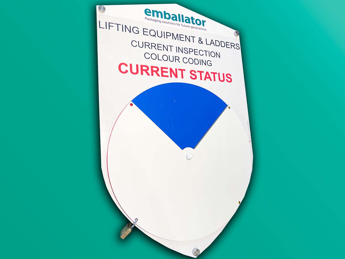
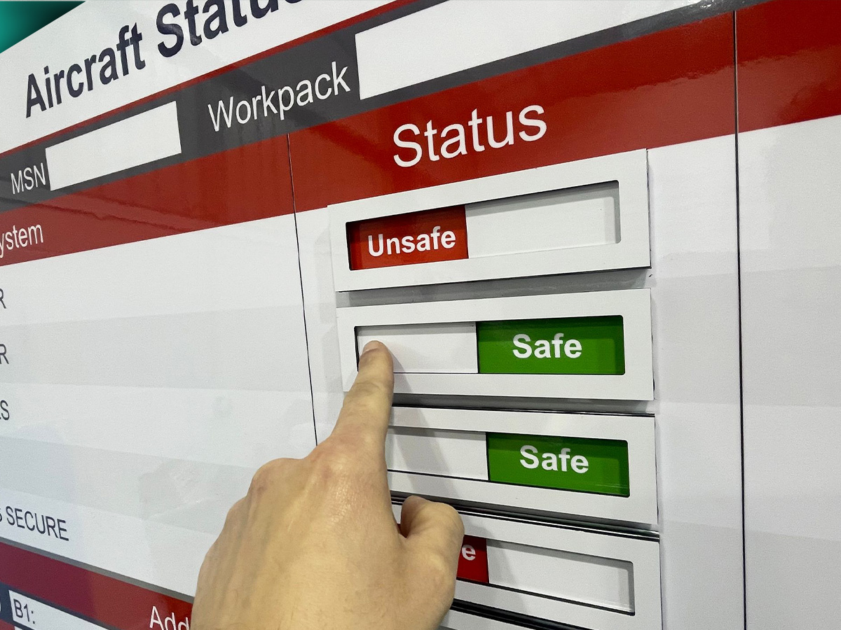
So, choose to add status indicator sliders to your Health & Safety board. Above all, communicate your safety procedures clearly. In addition, make them visually accessible to the whole team. Moreover, increase engagement with your safety rules. Assign red or green status. Also, choose to add custom text to your status sliders.
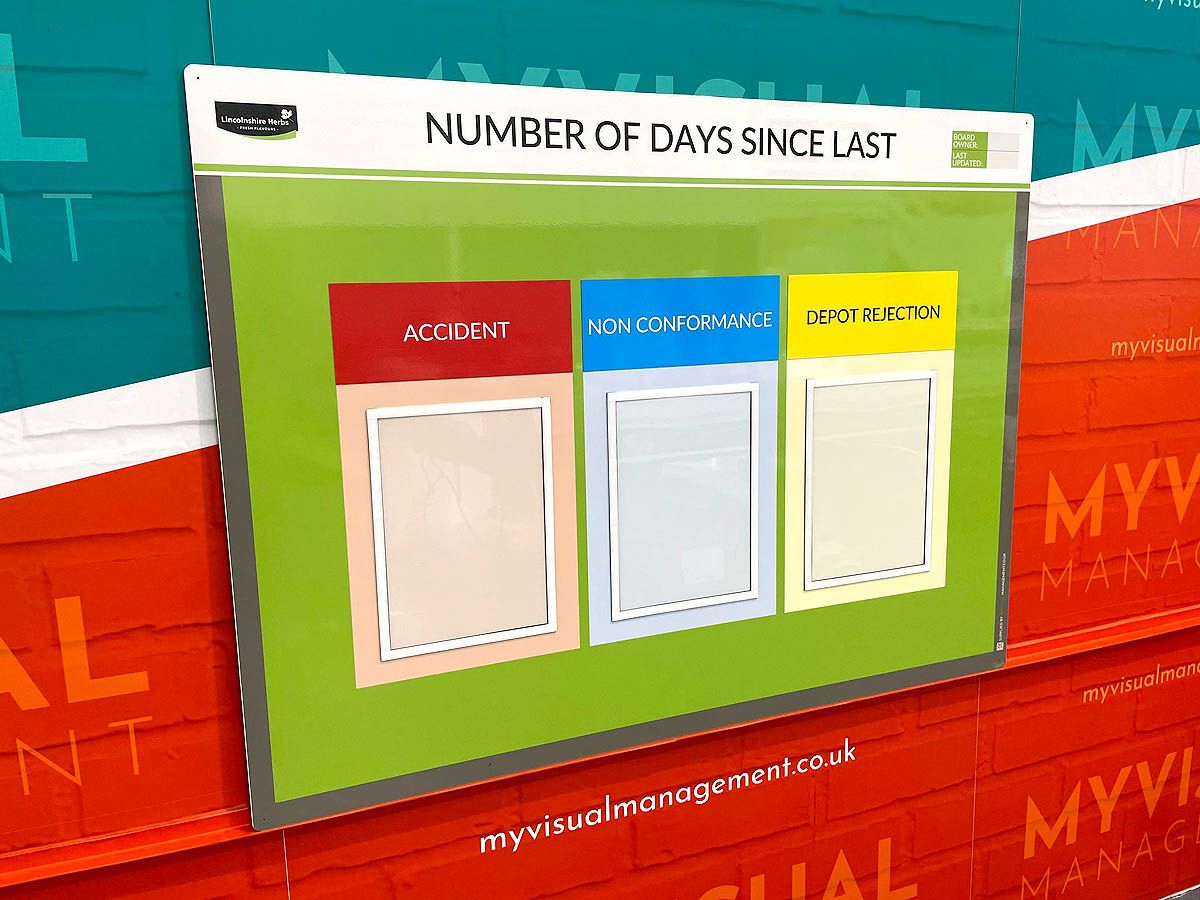
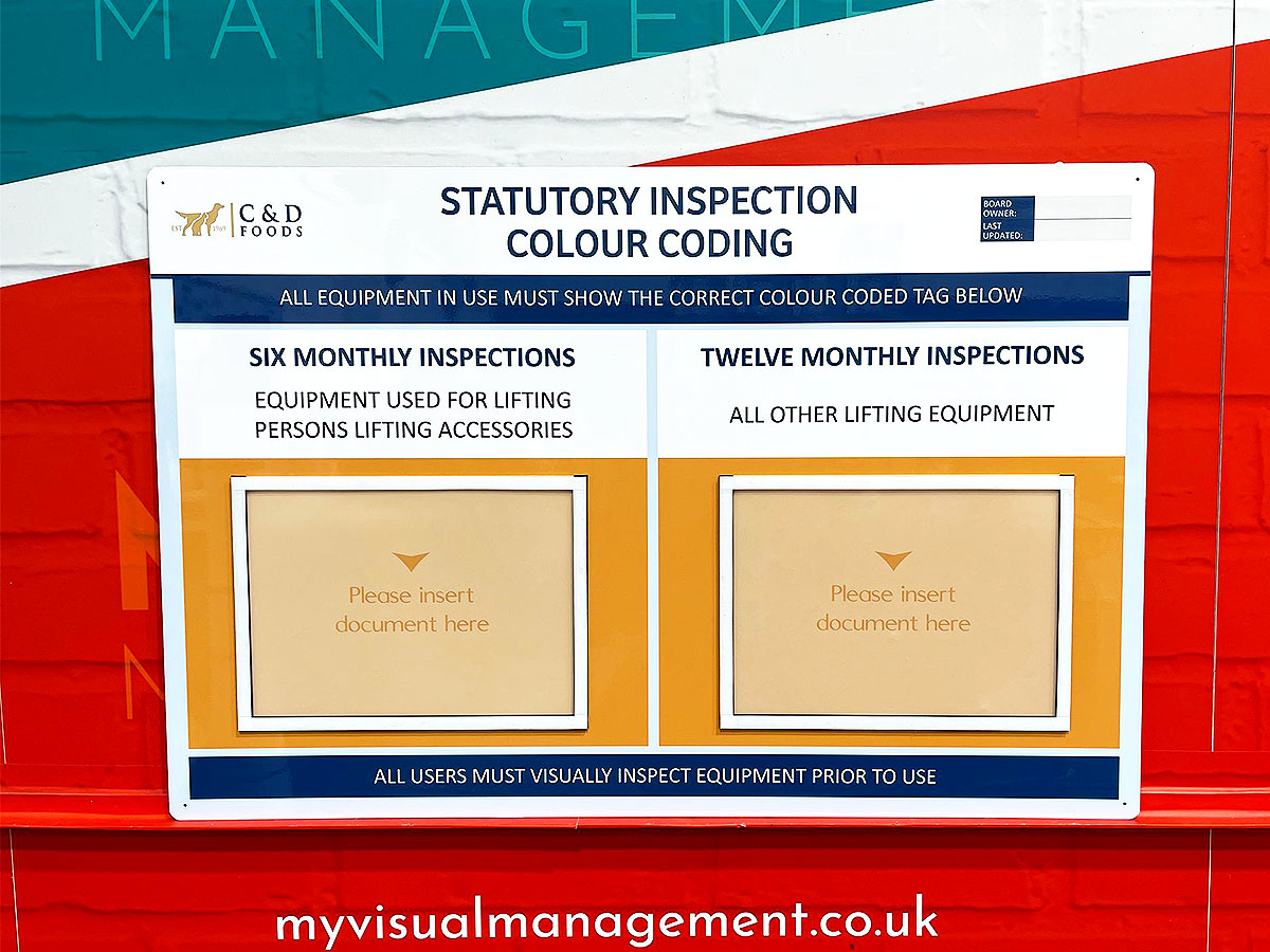
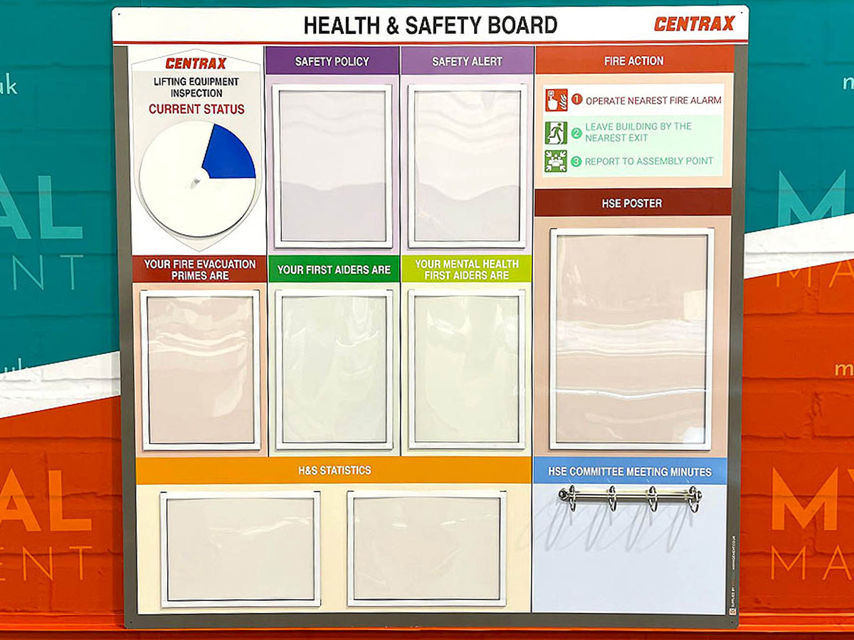
Choose document holders for your board
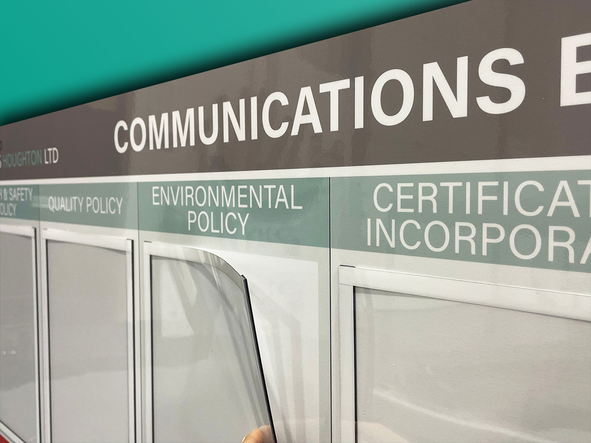
Choose magnetic document holders to keep your Health & Safety information visually accessible. Also, easy to update when procedures change. In addition, we have a range of sizes and colours for magnetic document holders.
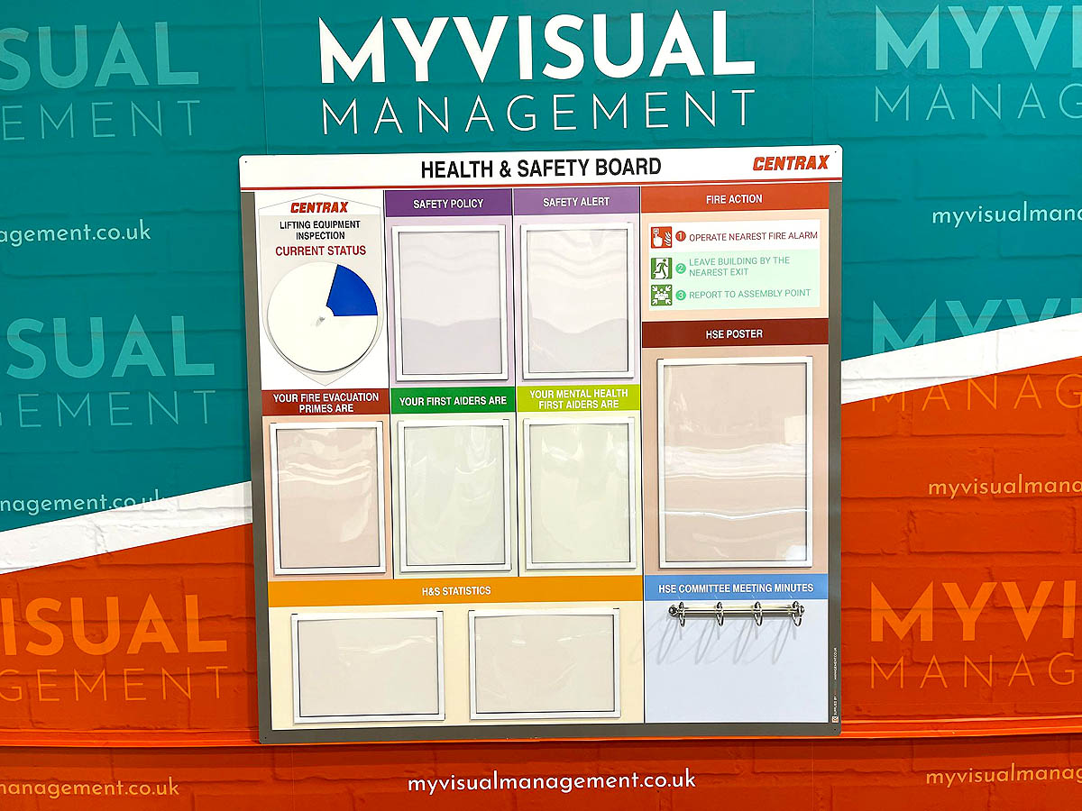
Colour coding is visual. In short, makes information visible.
Magnetic status indicators for safety
Magnetic status indicators for safety
Visual management delivers Health & Safety by making status instantly clear. Firstly, for instance, assign Red or Green status. Secondly, choose to use a combination of colours and graphics to communicate your safety procedures. Furthermore, make your magnetic status indicators dry wipe. Ultimately, easy to update. Likewise, see safety status at a glance.
Choose dry wipe (eraze) option
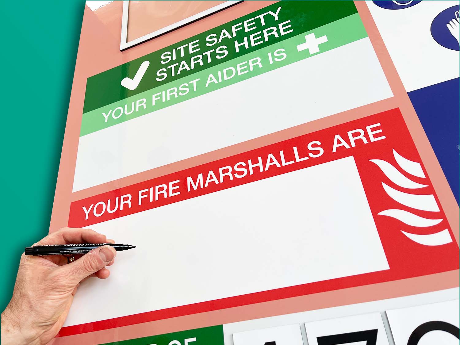
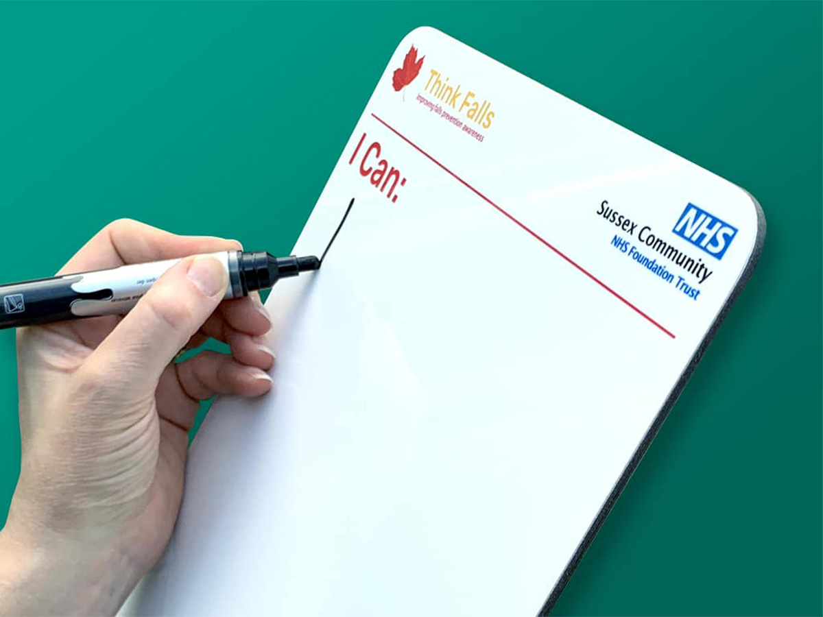
So, opting for a dry wipe finish on your Health & Safety board means updates are quick and easy. Therefore, futureproof your board. Likewise, benefit from instant real time reference. Above all, highly visual and effective, at a glance. Any time your key safety team members change, update your board at the same time.
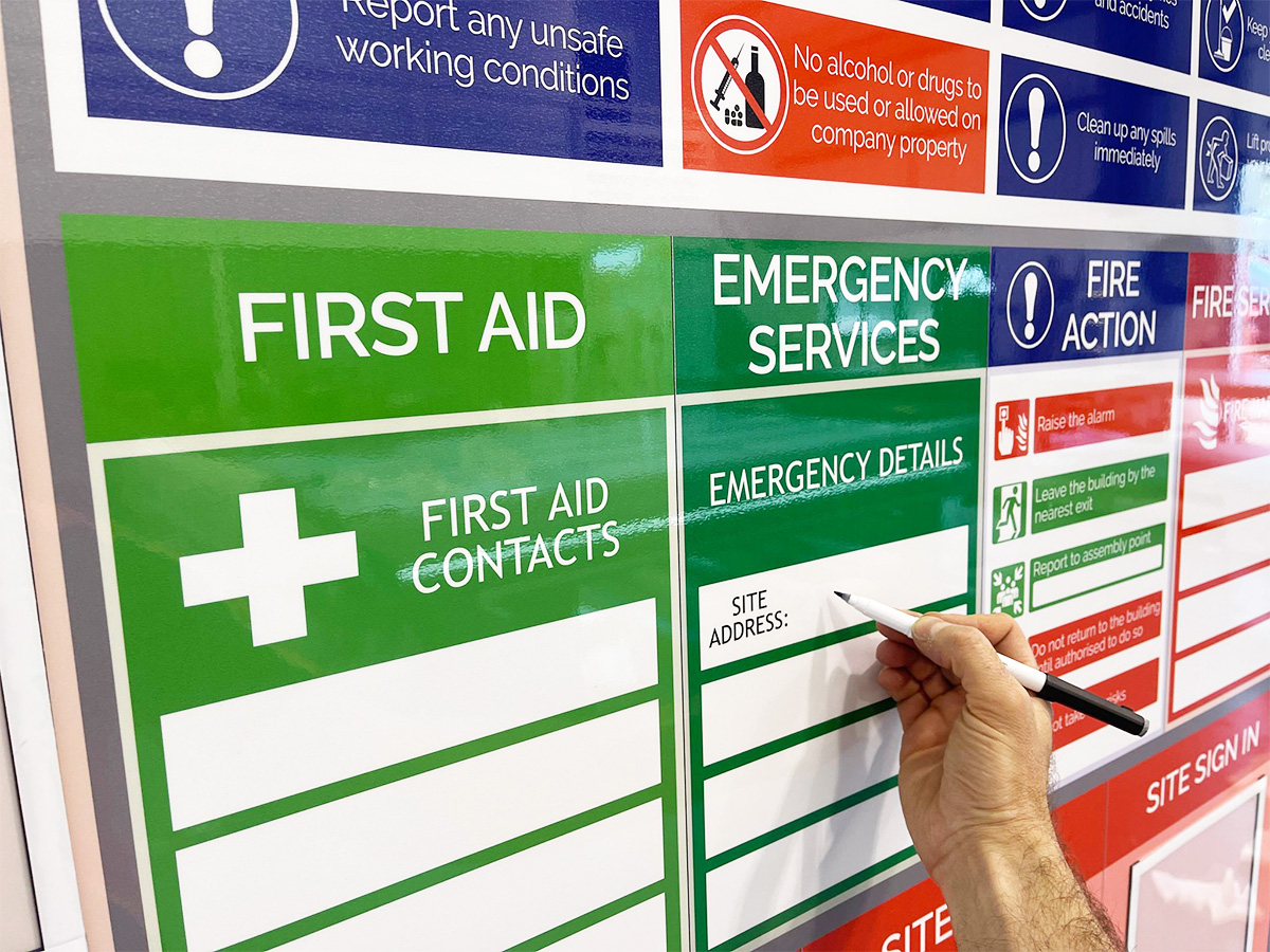
Dry wipe (eraze) finish makes updates easy

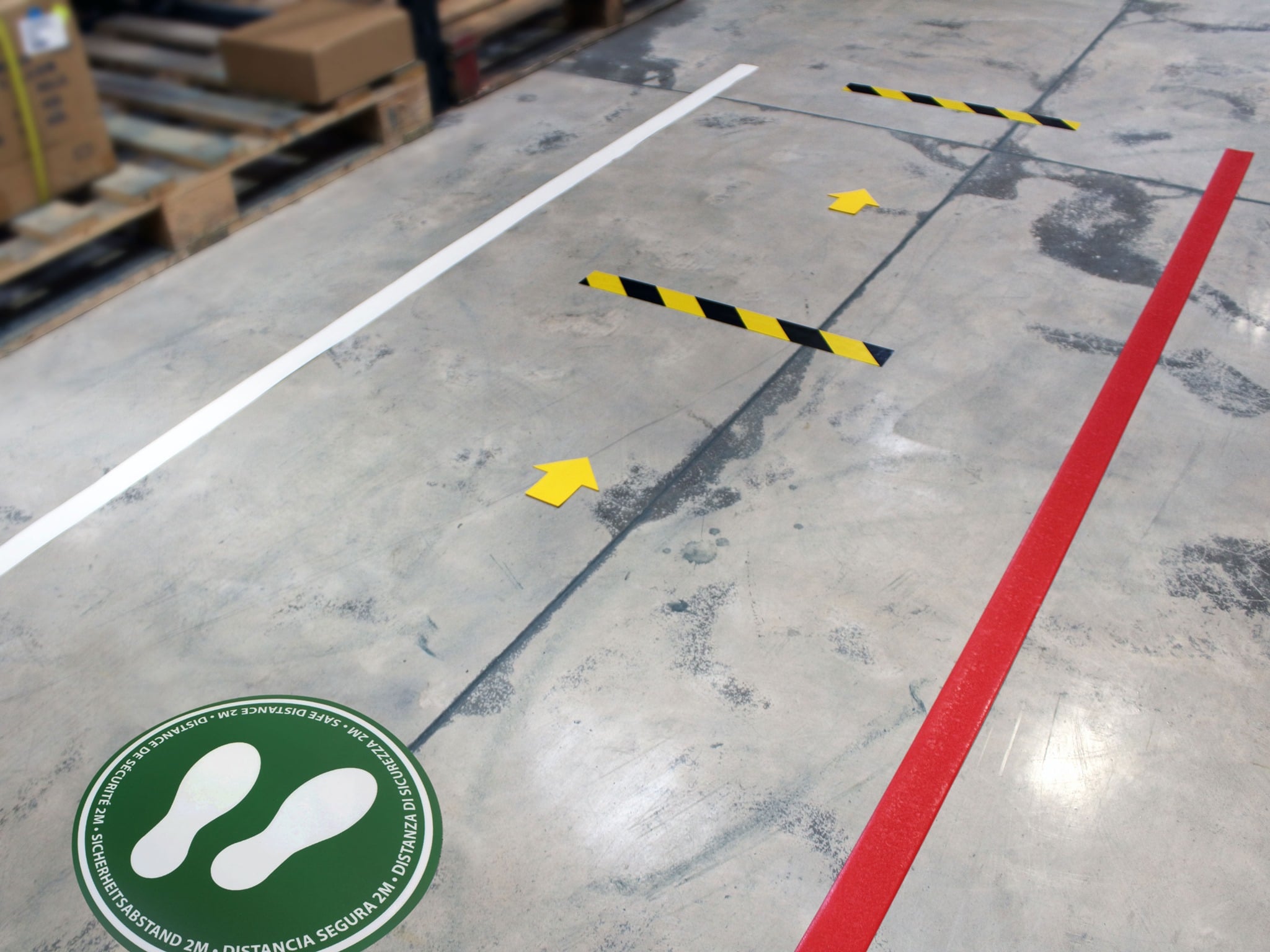
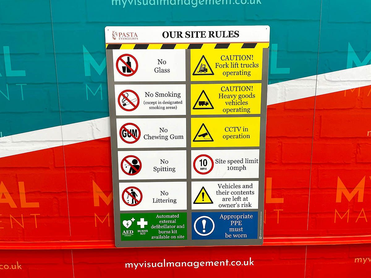
We make visuals for inside or outside. Most importantly, make your site rules clear.
Internal and External signage
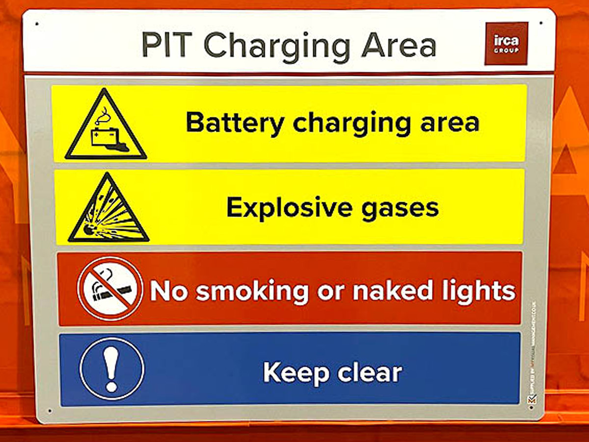
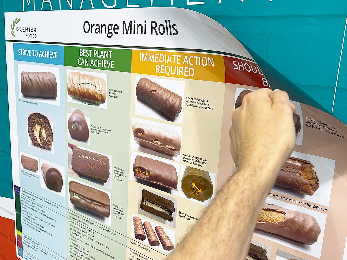
We translate your Health & Safety target on to the most suitable signs for your site. For example, magnetic signage, aluminium boards or whiteboard overlays. You may also choose dry wipe or magnetic options. Furthermore, we can make signs suitable for all environments, including outside.
We will help you decide the best solution for your site and space. Likewise, we turn your Health & Safety objective into a professional design with clear action points (in one or more languages).
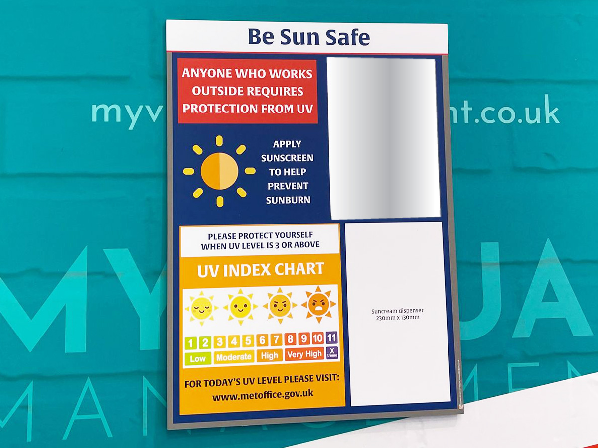
Promote Health & Safety to your team
Look after your team
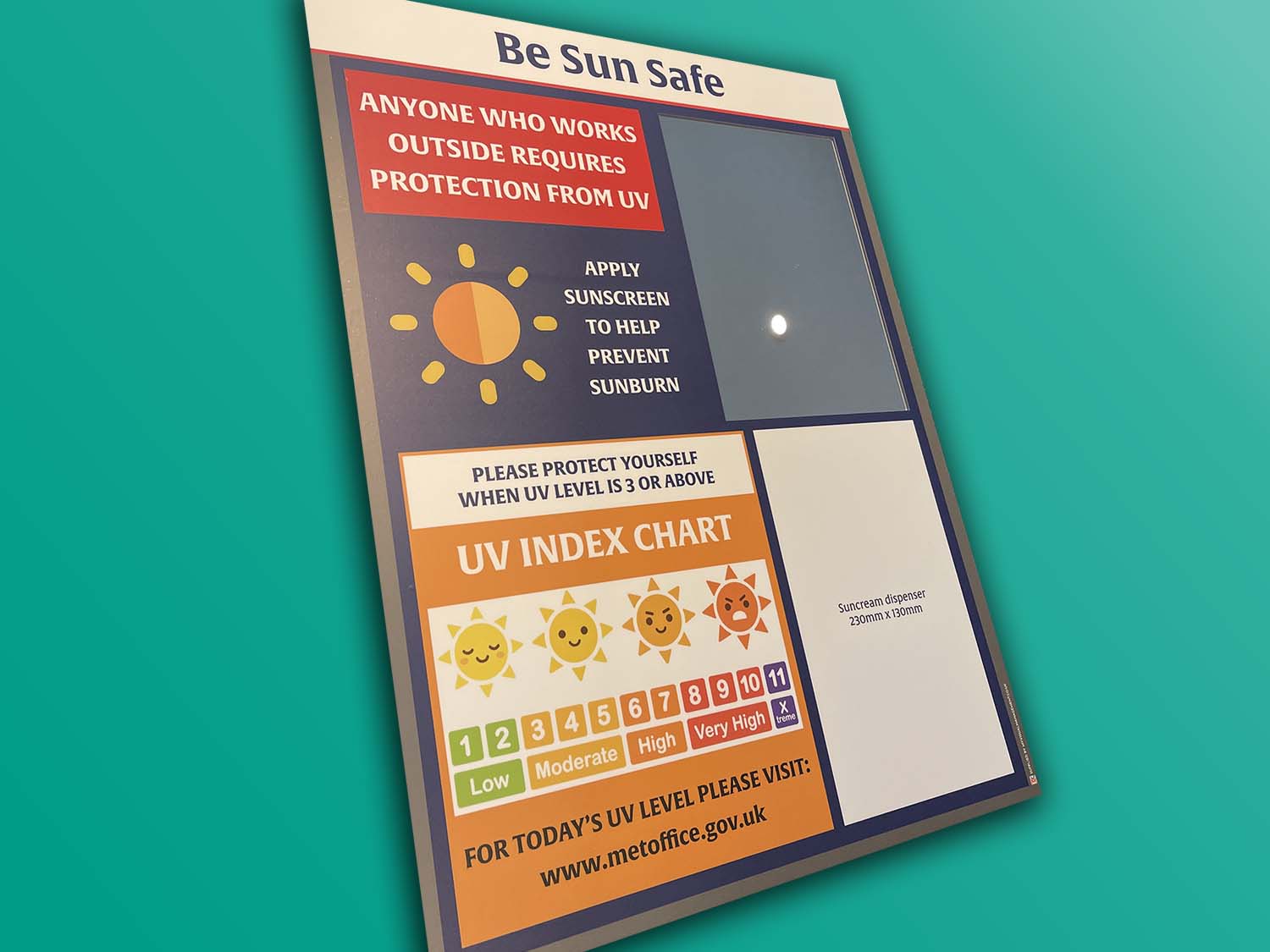
For example, choose to make a Sun Safe board. Furthermore, include accessories on your Sun Safe board such as a mirror and suncream dispenser.
Always try to make your Health & Safety rules and objectives easy to communicate. In addition, visual and accessible. Ultimately, for the whole team.
Check stations
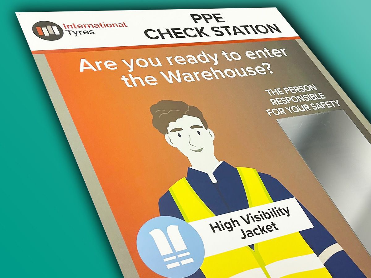
Important Health & Safety tools, check stations work because they are a visual checkpoint. For example, a PPE check station can show what PPE to wear in a critical area, before entering it. Other examples of check stations include allergen control check points.
In short, we deliver custom made check stations to meet your specific needs. You can also see examples of previous PPE check stations we’ve made.

Make your procedures clear in words and photos. For example, like this PPE board
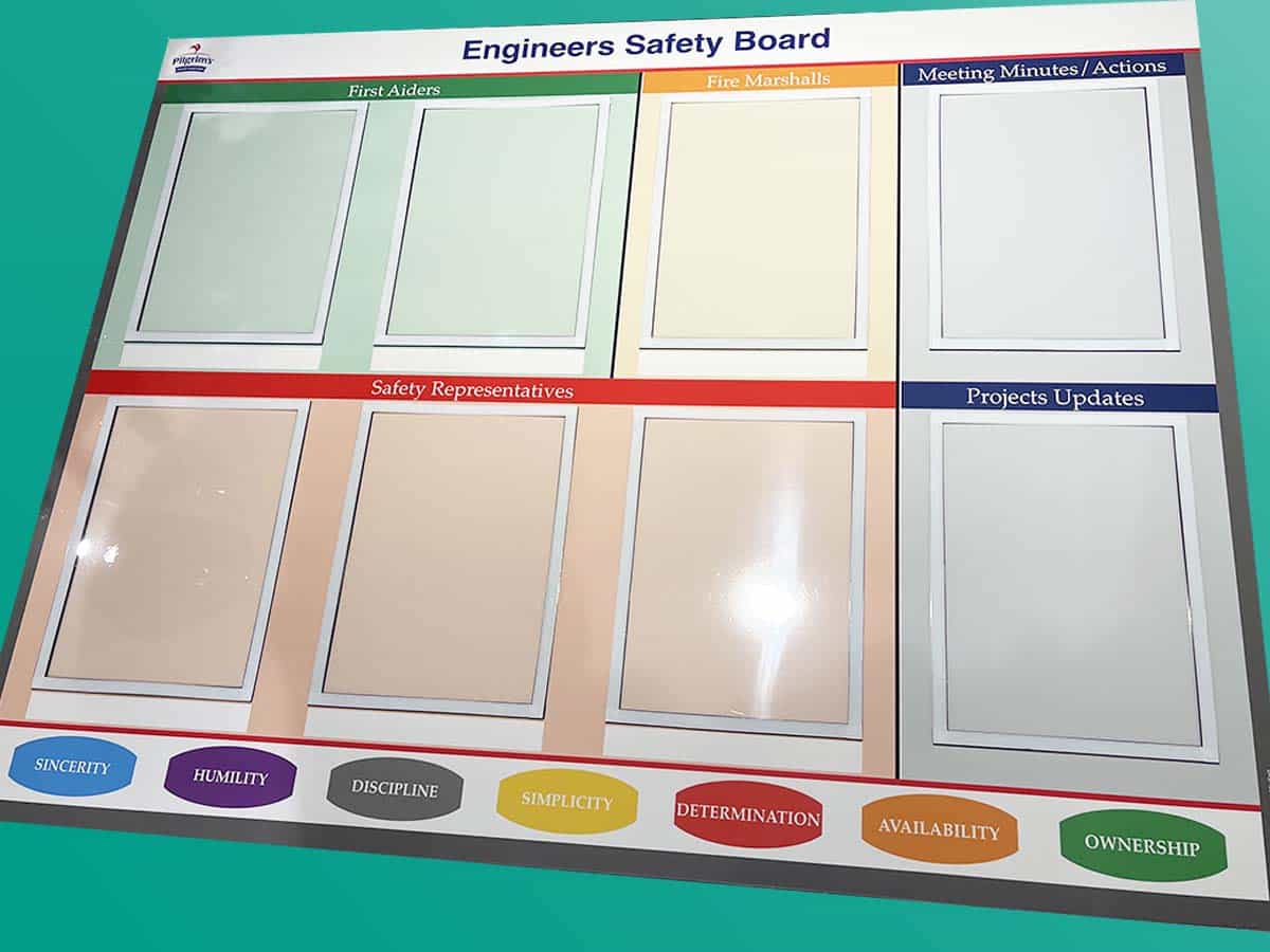
Further Health & Safety Board Examples
You May Also Like
Our Approach
We create visual management boards everyday. As a result we have plenty of experience. We work for organisations in food production, the power industry, national rail, pharmaceuticals, education, healthcare, packaging and distribution.
Our team works with a simple idea or sketch and creates a professionally designed layout. This is then turned into a highly functional visual management board.
We offer customised options because we want to create the perfect board for you. So, here are a few examples. We can add magnetic areas or a dry-wipe finish (for use with whiteboard pens). Furthermore, you can choose Red/Green sliders or R.A.G. (Red, Amber, Green) status dials so you can quickly and visually update your board. These are just a few examples of the ways in which our boards can be tailored to meet your needs. You may also be interested in whiteboard overlays that can be used on top of an existing magnetic board.


